Smart Forms
Responsive Form Framework
- Created By: Elflaire
- Created On: 18/03/2014
- Updated On: 15/06/2017
- Email: hello@doptiq.com
Thank you for purchasing Smart Forms. If you have any questions that are beyond the scope of this help file, please feel free to email me via my Codecanyon public profile page contact form here. Thank you so much once again, lets get started...
Form Setup
Getting started
To setup a working form Quickly go straight to the AJAX PHP SECTION
The forms use a single main CSS file which contains the general styling of all form elements as well as handling responsiveness through CSS3 Media Queries! In case you have any CSS resets such as Eric Mayers or Normalize in your website or web application, please make sure the form CSS files are loaded after / below the CSS file that contains your CSS reset rules to avoid any changes that may be caused by the reset, however this is still a rare case as the forms have their own reset rules :-). Additional optional stylesheets are used to style themes, we shall cover this in detail later on...
The forms do not depend on any images, fontawesome icons or javascript to fuction, they are entirely built using CSS3 and HTML5 therefore the fontawesome icons styleet and javacripts are all optional for those who need to use icons or javascript for purposes of ajax submition, form validation, masking or using the date-picker widget!
Internet Explorer Browser version 8 (IE8) has an additional fallback stylesheet for better enhancement and compartibility purposes, please note that this style is loaded via conditional comments, with an IF statement structure. For those who are using these forms to build your own custom forms, you will need additional Javascript files included via contitional comments, only for supporting placeholder attribute in old IE browsers IE9 and below, you can use any other placeholer plugins especially those that are not library dependent (ones that don't depend on libraries such as jQuery). If you don't need native placeholder support, just drop the contitional js files.
Folder Organization
When you open the SOURCE folder, you will find 3 folders (dark, elegant and flat), each of these folder represent a style, each style has its different themes. Furher inside each style folder are three folders again! ( AJAX PHP, Javascript enhancements and templates ).
- AJAX PHP - Includes working easy to setup ajax PHP forms - which include a contact form, order form, order form modal form e.t.c! WIth these you just setup an email in the settings file (PHP folder) and yo good to go!
- Javascript enhancements - Includes sample JavaScript and jQuery form widgets such as validation, masking and datepickers, colorpickers etc
- Template samples - Includes html and css form templates that you can use or modify to build your forms faster
TIP: For purposes of being organized, create a folder on your desktop or anywhere, copy the css, js, images folders from your chosen / preferred theme and paste them to your created folder - Next choose a template from the list of templates copy it to your folder and start to modify it to fit your needs, later we shall discuss how you can add validation and even some PHP to make it a fully working form.
Basic Form Setup
In brief, your basic CSS and HTML should look like the codes below, before you start putting any form elements to the canvas, next we shall look at how to include some form elemnts:
<!DOCTYPE html>
<html lang="en">
  <head>
    <title> Smart Forms - Form Title </title>
    <meta charset="utf-8">

    <!-- Mobile viewport meta tag -->

    <meta name="viewport" content="width=device-width, initial-scale=1.0">

    <!-- Form styleshets -->

    <link rel="stylesheet" type="text/css"  href="css/smart-forms.css">
    <link rel="stylesheet" type="text/css"  href="css/font-awesome.min.css">

    <!-- Placeholder support in IE9 and below -->

    <!--[if lte IE 9]>
    	<script type="text/javascript" src="js/jquery-1.9.1.min.js"></script>
        <script type="text/javascript" src="js/jquery.placeholder.min.js"></script>
    <![endif]-->


    <!-- IE8 Fallback styling -->

    <!--[if lte IE 8]>
        <link type="text/css" rel="stylesheet" href="css/smart-forms-ie8.css">
    <![endif]-->

</head>

<body>

	<!-- FORM CONTENT WILL GO HERE -->

</body>
</html>
HTML Structure
Load the relevant stylesheets and javascript in the head section
<head>

        <title> Smart Forms - Form Title </title>
        <meta charset="utf-8">

        <!-- Mobile meta -->

        <meta name="viewport" content="width=device-width, initial-scale=1.0">

        <!-- Form styleshets -->

        <link rel="stylesheet" type="text/css"  href="css/smart-forms.css">
        <link rel="stylesheet" type="text/css"  href="css/font-awesome.min.css">

        <!-- Placeholder support in IE9 and below -->

        <!--[if lte IE 9]>
            <script type="text/javascript" src="js/jquery-1.9.1.min.js"></script>
            <script type="text/javascript" src="js/jquery.placeholder.min.js"></script>
        <![endif]-->


        <!-- IE8 Fallback styling -->

        <!--[if lte IE 8]>
            <link type="text/css" rel="stylesheet" href="css/smart-forms-ie8.css">
        <![endif]-->

</head>
Setup all the necessary form sections in the body section
Inside the body section, wrap the form into two sections
- smart-wrap - added to control padding (prevents the form from filling the entire window on small devices by leaving some neat side space)
- smart-forms - Its a must section used to style the entire form, it has an extra class called wrap-3, this is used for controlling the form container width (i.e where the form sits), when you remove it the form fills the entire browser window, you will notice that you can change wrap-3 to wrap-0 upto wrap-4, you can even create your own wrapper and give it a max-width e.g in css add .wrap-7{ max-width: 1000px; }, then replace wrap-3 with your custom wrapper, the rest will take care of its self!
<body>

        <div class="smart-wrap">
            <div class="smart-forms wrap-3">

            	<!-- OUR MAIN FORM SECTIONS LOAD HERE - FORM HEADER | FORM BODY | FORM FOOTER -->

            </div><!-- end .smart-forms section -->
        </div><!-- end .smart-wrap section -->

</body>
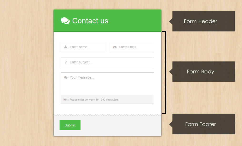
The form body and form footer are inside the form tag, the form header section is above the form tag like below!
<body class="woodbg">

        <div class="smart-wrap">
            <div class="smart-forms wrap-3">

                <!-- START FORM HEADER -->

                <div class="form-header header-primary">
                    <h4><i class="fa fa-comments"></i>Get in touch</h4>
                </div><!-- end .form-header section -->

                <form method="post" action="/" id="contact">

                    <!-- START FORM BODY -->

                    <div class="form-body">

                        <!-- ALL FORM ELEMENTS WILL GO HERE -->

                    </div><!-- end .form-body section -->


                    <!-- START FORM FOOTER -->

                    <div class="form-footer">

                        <button type="submit" class="button btn-primary">Submit</button>

                    </div><!-- end .form-footer section -->

                </form>

            </div><!-- end .smart-forms section -->
        </div><!-- end .smart-wrap section -->

</body>
Form elements markup
A simple contact form has markup that looks like below!
	<div class="smart-wrap">
    	<div class="smart-forms wrap-3">

          <div class="form-header header-primary">
            	<h4><i class="fa fa-comments"></i>Get in touch</h4>
          </div><!-- end .form-header section -->

            <form method="post" action="/" id="contact">
            	<div class="form-body">

                    <div class="section">
                    	<label for="names" class="field-label">Your Personal Names</label>
                    	<label for="names" class="field prepend-icon">
                            <input type="text" name="names" id="names" class="gui-input" placeholder="Enter name...">
                            <span class="field-icon"><i class="fa fa-user"></i></span>
                        </label>
                    </div><!-- end section -->

                    <div class="section">
                    	<label for="email" class="field-label">Your Email Address</label>
                    	<label for="email" class="field prepend-icon">
                            <input type="email" name="email" id="email" class="gui-input" placeholder="example@domain.com...">
                            <span class="field-icon"><i class="fa fa-envelope"></i></span>
                        </label>
                    </div><!-- end section -->

                    <div class="section">
                    	<label for="telephone" class="field-label">Telephone / Mobile </label>
                    	<label for="telephone" class="field prepend-icon">
                            <input type="tel" name="telephone" id="telephone" class="gui-input" placeholder="Enter telephone...">
                            <span class="field-icon"><i class="fa fa-phone-square"></i></span>
                        </label>
                    </div><!-- end section -->

                    <div class="section">
                    	<label for="comment" class="field-label">Message / Comment </label>
                    	<label for="comment" class="field prepend-icon">
                            <textarea class="gui-textarea" id="comment" name="comment"></textarea>
                            <span class="field-icon"><i class="fa fa-comments"></i></span>
                            <span class="input-hint"> <strong>Hint:</strong> Please enter between 80 - 300 characters.</span>
                        </label>
                    </div><!-- end section -->

                </div><!-- end .form-body section -->
                <div class="form-footer">
                	<button type="submit" class="button btn-primary">Submit</button>
                </div><!-- end .form-footer section -->
            </form>

        </div><!-- end .smart-forms section -->
    </div><!-- end .smart-wrap section -->
Building forms
To build a form do the following
1. Put main form sections (FORM HEADER, FORM BODY and FORM FOOTER) markup into the BODY section of your HTML document like below
	<div class="smart-wrap">
    	<div class="smart-forms wrap-3">

          <div class="form-header header-primary">
            	<h4><i class="fa fa-comments"></i>Get in touch</h4>
          </div><!-- end .form-header section -->

            <form method="post" action="/" id="contact">
            	<div class="form-body">

                 <!-- OUR FORM ELEMENTS WILL GO HERE -->

                </div><!-- end .form-body section -->
                <div class="form-footer">
                	<button type="submit" class="button btn-primary">Submit</button>
                </div><!-- end .form-footer section -->

            </form>

        </div><!-- end .smart-forms section -->
    </div><!-- end .smart-wrap section -->
2. Include Form elements markup (inputs, selects, radios etc)
Input elements include all text input elements including the new HTML5 custom inputs, such as text, password, tel, search, email, url, the markup for inputs looks as follows.
Text input
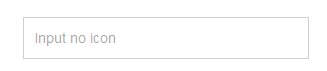
Create an input type text, wrap it inside a label with a class field, thats it
    <div class="section">
        <label class="field">
            <input type="text" class="gui-input" placeholder="Input no icon">
        </label>
    </div><!-- end section -->
Text inputs with icons
Text input with icon left
    <div class="section">
        <label class="field prepend-icon">
            <input type="text" name="firstname" id="firstname" class="gui-input" placeholder="Text input icon left">
            <span class="field-icon"><i class="fa fa-user"></i></span>
        </label>
    </div><!-- end section -->
Text input with icon right
    <div class="section">
        <label class="field append-icon">
            <input type="text" name="firstname" id="firstname" class="gui-input" placeholder="Text input icon left">
            <span class="field-icon"><i class="fa fa-user"></i></span>
        </label>
    </div><!-- end section -->
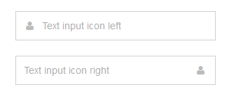
Text inputs with icons, tooltips, labels
Place the tooltip markup immediately below the input, please note that tooltips can be in 6 directions, left, left-top, left-bottom, right, right-top, right-bottom. You choose whichever suits your design and style...
The markup above will create an input type text field below with a label above it, when you click on the label text, the input will be focused because the label for="names" is the same as the input id="names". The words Enter name...are put there with the help of the new HTML5 form placeholder attribute, please note that this attribute is only available in modern browsers, that is why we included the jQuery placeholder plugin to have it available in old Internet Explorer Browsers versions 9 and below.
    <div class="section">
        <label for="names" class="field-label">Icon left + tooltip left</label>
        <label class="field prepend-icon">
            <input type="text" name="names" id="names" class="gui-input" placeholder="Enter name...">
            <b class="tooltip tip-left"><em> Hey buddy! iam a left tooltip. You notice me now huh?</em></b>
            <span class="field-icon"><i class="fa fa-user"></i></span>
        </label>
    </div><!-- end section -->
Other Web Forms 2.0 input types
HTML5 is the newest specification for HTML, the language that web browsers read to display web pages. HTML5 has many new features intended to make creating websites easier and people's experience in using those websites better. Among those features are many enhancements to web forms.
New form features and input elements, these include the following
- color
- date
- datetime
- datetime-local
- month
- number
- range
- search
- tel
- time
- url
- week
More elemnts include
- meter
- progress
- output
- keygen
These are also accompanied by new form attributes to enhance the forms
- form
- readonly
- autocomplete
- autofocus
- list
- pattern
- required*
- placeholder
- multiple
- list
- min
- max
- step
- form action
- form enctype
- form method
- form target
- form novalidate
Smart forms focuses on some of those new shinny elements are styled directly such as:-
- search - Used on search forms
- url - Used on web addresses
- email - Used on email addresses
- password - Used for passwords
- tel - Used for phone numbers
More elements supported via jQuery plugins include:-
- color - Using the spectrum color picker
- date - Using the UI date picker
- datetime - Using the UI date / time picker addon
- time - Using the UI date / time picker addon
- month - Using the UI date / month picker addon
- number - Using the numeric stepper plugin
- range - Using the UI slider
To create another input but of a diffent type such as email, the markup will change a little bit, on the type="email" part and the for=" " for the label and id=" " to match the label, and even the placeholer=" " text will of course change to match your desired text!
Whats the difference, you may ask?
Well not so much for now especially on desktops, however when you view your forms on a modern smartphone like the iPhone, you will notice some differences for example when you tap / focus on the email input, the touch pad keys will somehow change to include some special email characters like the@ , when you tap an input such as number, the touch pad keys change to numeric, so that somehow makes a huge difference and Improves the user experience for those viewing your forms on smart phones / mobile devices and tablets.
Email Input
    <div class="section">
        <label class="field prepend-icon">
            <input type="email" name="email" id="email" class="gui-input" placeholder="Email input">
            <span class="field-icon"><i class="fa fa-envelope"></i></span>
        </label>
    </div><!-- end section -->
Telephone Input
    <div class="section">
        <label class="field prepend-icon">
            <input type="tel" name="mobile" id="mobile" class="gui-input" placeholder="Telephone input">
            <span class="field-icon"><i class="fa fa-phone-square"></i></span>
        </label>
    </div><!-- end section -->
Web URL Input
    <div class="section">
        <label class="field prepend-icon">
            <input type="url" name="website" id="website" class="gui-input" placeholder="URL input">
            <span class="field-icon"><i class="fa fa-globe"></i></span>
        </label>
    </div><!-- end section -->
Password Input
    <div class="section">
        <label class="field prepend-icon">
            <input type="password" name="password" id="password" class="gui-input" placeholder="Password input">
            <span class="field-icon"><i class="fa fa-lock"></i></span>
        </label>
    </div><!-- end section -->
Textarea
    <div class="section">
        <label class="field prepend-icon">
            <textarea class="gui-textarea" id="comment" name="comment" placeholder="Text area"></textarea>
            <span class="field-icon"><i class="fa fa-comments"></i></span>
            <span class="input-hint">
                <strong>Hint:</strong> This is a hint below the textarea
            </span>
        </label>
    </div><!-- end section -->
Drop select - with single arrow
    <div class="section colm colm6">
        <label class="field select">
            <select id="country" name="country">
                <option value="">Select </option>
                <option value="AL">Albania</option>
                <option value="DZ">Algeria</option>
                <option value="AD">Andorra</option>
            </select>
            <i class="arrow"></i>
        </label>
    </div><!-- end section -->
Drop select - with double arrow
    <div class="section colm colm6">
        <label class="field select">
            <select id="country" name="country">
                <option value="">Select </option>
                <option value="AL">Albania</option>
                <option value="DZ">Algeria</option>
                <option value="AD">Andorra</option>
            </select>
            <i class="arrow double"></i>
        </label>
    </div><!-- end section -->
Multiple select
    <div class="section colm colm6">
        <label class="field select-multiple">
            <select id="country" name="country" multiple>
                <option value="">Select </option>
                <option value="AL">Albania</option>
                <option value="DZ">Algeria</option>
                <option value="AD">Andorra</option>
            </select>
        </label>
    </div><!-- end section -->
File input / uploader
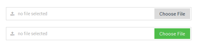
The markup for file-input / browser is also somehow different, its markup looks like below
<div class="section">
    <label class="field file prepend-icon">
        <span class="button"> Choose File </span>
        <input type="file" class="gui-file" name="file1" id="file1" onChange="document.getElementById('uploader1').value = this.value;">
        <input type="text" class="gui-input" id="uploader1" placeholder="no file selected" readonly>
        <span class="field-icon"><i class="fa fa-upload"></i></span>
    </label>
</div><!-- end  section -->
For multiple file-inputs / browsers you will have to adjust the markup, for example the next uploader should look like this
NOTICE The name changed to name="file2" and id="file2"
ALSO the on change and input below id changed to onChange="document.getElementById('uploader2')and id="uploader2" so the next uploader should also have those values changed for consistency.
<div class="section">
    <label class="field file prepend-icon">
        <span class="button"> Choose File </span>
        <input type="file" class="gui-file" name="file2" id="file2" onChange="document.getElementById('uploader2').value = this.value;">
        <input type="text" class="gui-input" id="uploader2" placeholder="no file selected" readonly>
        <span class="field-icon"><i class="fa fa-upload"></i></span>
    </label>
</div><!-- end  section -->
Radio options
<div class="section">
    <div class="option-group field">

        <label class="option">
            <input type="radio" name="radio1" checked>
            <span class="radio"></span> Radio Option 1
        </label>

        <label class="option">
            <input type="radio" name="radio1">
            <span class="radio"></span> Radio Option 2
        </label>

    </div><!-- end .option-group section -->
</div><!-- end section -->
Checkbox options
<div class="section">
    <div class="option-group field">

        <label class="option">
            <input type="checkbox" name="checkbox1" checked>
            <span class="checkbox"></span> Checkbox Option 1
        </label>

        <label class="option">
            <input type="checkbox" name="checkbox1">
            <span class="checkbox"></span> Checkbox Option 2
        </label>

    </div><!-- end .option-group section -->
</div><!-- end section -->
Toggle switches
A toggle switch can be a radio option or a checkbox option element depending on what your preferences are, to make toggle switches, they also use HTML5 data attribute for the text so you can eaily replace the data-on="YES" and data-off="NO" text with your own text instead of hacking the CSS. Make sure to use is shorter text though, it makes the switch look prettier, the markup will look like this:
<div class="section">
    <div class="option-group field">

        <label class="switch">
            <input type="checkbox" name="switch1" id="switch1" value="switch1">
            <span class="switch-label" data-on="ON" data-off="OFF"></span>
            <span> Switch 1 </span>
        </label>

        <label class="switch">
            <input type="checkbox" name="switch2" id="switch2" value="switch2">
            <span class="switch-label" data-on="ON" data-off="OFF"></span>
            <span> Switch 2 </span>
        </label>

    </div><!-- end .option-group section -->
</div><!-- end section -->
Star Rating / Review widgets
If you need a cleaner way to add a rating widget to your forms you will use the star rating markup, it also supports hover back after selection. Please note that the star rating works best with fontawesome icons, the alternative would be using unicode characters however they don't look smooth in IE.
    <div class="rating block">
        <span class="lbl-text">Customization</span>
        <div class="rating-wrapper">
            <input class="rating-input" id="r5" type="radio"  name="custom" checked>
            <label class="rating-star" for="r5"><i class="fa fa-star"></i><span>Excellent</span></label>
            <input class="rating-input" id="r4" type="radio"  name="custom">
            <label class="rating-star" for="r4"><i class="fa fa-star"></i><span>Good</span></label>
            <input class="rating-input" id="r3" type="radio"  name="custom">
            <label class="rating-star" for="r3"><i class="fa fa-star"></i><span>Tried</span></label>
            <input class="rating-input" id="r2" type="radio"  name="custom">
            <label class="rating-star" for="r2"><i class="fa fa-star"></i><span>Fair</span></label>
            <input class="rating-input" id="r1" type="radio"  name="custom">
            <label class="rating-star" for="r1"><i class="fa fa-star"></i><span>Poor</span></label>
        </div>
    </div><!-- end rating section -->
Smart widgets
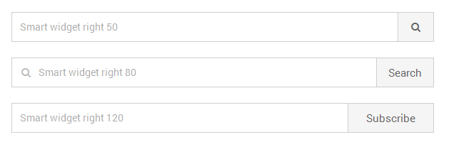
Sometimes you need to create a form input element with a button, the smart widget will come to your rescue, it has 3 sizes which can easily be modified to suite your needs.
<div class="section">
    <div class="smart-widget sm-right smr-120">
        <label class="field">
        	<input type="text" name="sub3" id="sub3" class="gui-input" placeholder="Smart widget right 120">
        </label>
        <button type="submit" class="button"> Subscribe </button>
    </div><!-- end .smart-widget section -->
</div><!-- end section -->
Form Buttons
Buttons inlude all input buttons, button tag buttons, link (a) buttons, cancel buttons and any element you want to turn into a button. Buttons come in 8 color themes default grey, black, blue, green, purple, red, yellow and primary. To add a button, go to the form buttons section and add a button element then add a button class to it..
Button markup
You can create a button from the following elements

<!-- Button with an input type button -->
<input type="submit" value="Button" class="button">

<!-- Button with the button element -->
<button class="button"> Button </button>

<!-- Button with an anchor tag -->
<a href="#" class="button"> Button </a>
Rounded Buttons
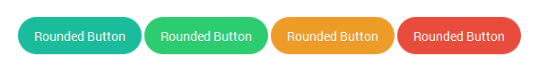
<button class="button btn-rounded"> Button Rounded </button>
Pushed Buttons
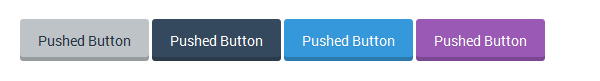
<button class="button pushed"> Button Pushed </button>
Left and Right Buttons
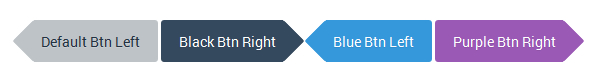
<button class="button button-left"> Button Left </button>
<button class="button button-right"> Button Right </button>
Pointed Buttons
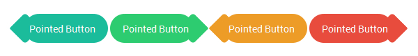
<button class="button btn-pointed button-left"> Pointed Button Right </button>
<button class="button btn-pointed button-right"> Pointed Button Right </button>
Button themes
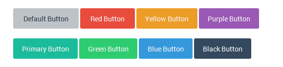
<button class="button"> Button Default </button>
<button class="button btn-primary"> Button Primary </button>
<button class="button btn-red"> Button Red </button>
<button class="button btn-blue"> Button Blue </button>
<button class="button btn-black"> Button Black </button>
<button class="button btn-yellow"> Button Yellow </button>
<button class="button btn-purple"> Button Purple </button>
<button class="button btn-green"> Button Green </button>
Normal Progress Bars

<div class="progress-bar bar-primary">
    <div class="bar"></div>
    <div class="percent"></div>
</div>

<div class="progress-bar bar-green">
    <div class="bar"></div>
    <div class="percent"></div>
</div>

<div class="progress-bar bar-red">
    <div class="bar"></div>
    <div class="percent"></div>
</div>

<div class="progress-bar bar-yellow">
    <div class="bar"></div>
    <div class="percent"></div>
</div>

<div class="progress-bar bar-purple">
    <div class="bar"></div>
    <div class="percent"></div>
</div>

<div class="progress-bar bar-black">
    <div class="bar"></div>
    <div class="percent"></div>
</div>

<div class="progress-bar bar-blue">
    <div class="bar"></div>
    <div class="percent"></div>
</div>
Animated Progress Bars
<div class="progress-bar progress-animated bar-primary">
    <div class="bar"></div>
    <div class="percent"></div>
</div>
Notification Messages / Alerts
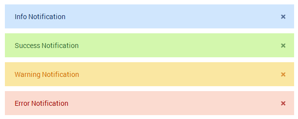
<!-- info notification - blue -->
<div class="notification alert-info">
    <p>Info Notification </p>
    <a href="#" class="close-btn">×</a>
</div>

<!-- success notification - green -->
<div class="notification alert-success">
    <p>Success Notification</p>
    <a href="#" class="close-btn">×</a>
</div>

<!-- warning notification - yellow -->
<div class="notification alert-warning">
    <p>Warning Notification</p>
    <a href="#" class="close-btn">×</a>
</div>

<!-- error notification - red -->
<div class="notification alert-error">
    <p>Error Notification</p>
    <a href="#" class="close-btn">×</a>
</div>
Form with the Grid System
The Grid system is used for creating form layouts through a series of rows and columns that house your form elements. Here's how the Smart Forms grid system works:
- Use rows
.frm-rowto create horizontal groups of columns.colm. - Content should be placed within columns, and only columns may be immediate children of rows.
- If an element does not require the grid for example a sigle input, dont use the grid, just place it inside a div with a
.sectionclass . - Predefined grid classes like
.frm-rowand.colmare available for quickly making grid form layouts. - Column classes
.colmmust immediately be followed by a column number or value such as.colm4, so the entire class will look like this class ="colm colm4" - Grid form columns are created by specifying the number of twelve available columns you wish to span. For example, three equal columns would use three
.colm4 - You can add your own padding classes to the grid to create more prettier spaced grids for example, using the padding spacers provided you can create more space to the left or right of a given colum grid like this:- class ="
colm colm6 pad-r30"Where by.pad-r30adds a 30px padding to the right of the column, for the left side you can use something like.pad-l30, if you are using your own classes, use padding instead of margin, it works better.
You can build a very complex form using a 12 column grid included in the package.
A combination of all columns in a row must add up to 12 for example:
Two equal columns 6+6 = 12
Two unequal columns 5+7 = 12
Six equal columns 2+2+2+2+2+2 = 12
Three equal columns 4+4+4 = 12
Grid Examples
<!-- 12 Equal Columns -->
<div class="frm-row">
  <div class="colm colm1">.colm colm1</div>
  <div class="colm colm1">.colm colm1</div>
  <div class="colm colm1">.colm colm1</div>
  <div class="colm colm1">.colm colm1</div>
  <div class="colm colm1">.colm colm1</div>
  <div class="colm colm1">.colm colm1</div>
  <div class="colm colm1">.colm colm1</div>
  <div class="colm colm1">.colm colm1</div>
  <div class="colm colm1">.colm colm1</div>
  <div class="colm colm1">.colm colm1</div>
  <div class="colm colm1">.colm colm1</div>
  <div class="colm colm1">.colm colm1</div>
</div>

<!-- 2 unequal columns left large 8 right small 4  -->
<div class="frm-row">
  <div class="colm colm8">.colm colm8</div>
  <div class="colm colm4">.colm colm4</div>
</div>

<!-- 3 Equal Columns -->
<div class="frm-row">
  <div class="colm colm4">.colm colm4</div>
  <div class="colm colm4">.colm colm4</div>
  <div class="colm colm4">.colm colm4</div>
</div>

<!-- 2 Equal Columns -->
<div class="frm-row">
  <div class="colm colm6">.colm colm6</div>
  <div class="colm colm6">.colm colm6</div>
</div>
Grid with form markup
Below is an example of a two column grid using 6+6=12, in case you need something like 3 columns them colm6 will change to colm4 which is 4+4+4=12

                    <div class="frm-row">

                        <div class="section colm colm6">
                            <label for="firstname" class="field prepend-icon">
                                <input type="text" name="firstname" id="firstname" class="gui-input" placeholder="First name...">
                                <span class="field-icon"><i class="fa fa-user"></i></span>
                            </label>
                        </div><!-- end section -->

                        <div class="section colm colm6">
                            <label for="lastname" class="field prepend-icon">
                                <input type="text" name="lastname" id="lastname" class="gui-input" placeholder="Last name...">
                                <span class="field-icon"><i class="fa fa-user"></i></span>
                            </label>
                        </div><!-- end section -->

                    </div><!-- end frm-row section -->
Javascript Input Widgets
The rest of the widgets are powered by JQuery, these include date pickers, sliders, numeric steppers, month pickers, time pickers, colorpickers. Their respective markup will be discussed in the Javascript section
CSS Files and Structure
I am loading different styles depending on requirements - however the common ones are smart-forms.css, and fontawesome.css other styles are used for theme purposes or widgets. The forms come with eight themes default grey, primary, blue, red, yellow, black, purple, green.
- smart-forms.css - main form css file
- font-awesome.min.css - fontawesome css file
- smart-themes - loads form color themes
- smart-addons.css - loads all plugin css in a single file
- smart-loader.css (introduced in version 4) - loads all plugin css individual styles using media queries
QUICK NOTE ON - smart-addons.css and smart-loader.css
The above two files perform the same work so you can use one of them not both the difference is that smart-addons.css loads all plugin css in a single file which can be easy for purposes of loading and minification to avoid using multiple files. However in version 4 i added smart-loader.css which loads single plugin files so you can easily remove the plugin css files you don't want to load instead of loading all css in one file. It also makes managing changes and CSS a bit easy however it may have performance issues given that it uses css @import to load css compared to smart-addons.css, so the choice is yours you can use one that best fits your requirements.
smart-forms.css
All the main styling is done inside this css file - you can edit or modify form elements and styles indied this file to suit your needs, it comes with the default theme which is primary green
Form Background CSS
You can change the form background image by changing the following styles
    /* @backgrounds :: modify or add yours below
    ------------------------------------------------------------------- */
    .darkbg{ background:#6C82A2 url(../images/dark.png) repeat fixed; }
    .woodbg{ background:#E6CCA6 url(../images/wood.png) repeat fixed; }
Form Wrapper Width
You can change the form width dimensions by changing the following styles, modify or create your own styles
    .wrap-0{ max-width:952px; }
    .wrap-1{ max-width:852px; }
    .wrap-2{ max-width:652px; }
    .wrap-3{ max-width:452px; }
Form Header CSS
You can change the form header by changing the following styles
    /* @form header section
    ----------------------------------------- */
    .smart-forms .form-header{
        overflow:hidden;
        position:relative;
        padding:25px 30px;
        -webkit-border-radius:5px 5px 0 0 ;
        -moz-border-radius:5px 5px 0 0 ;
        -o-border-radius:5px 5px 0 0 ;
        border-radius:5px 5px 0 0 ;
    }

    .smart-forms .form-header h4 {
        font-family:"Roboto", Arial, Helvetica, sans-serif;
        text-align:left;
        font-weight:300;
        font-size:32px;
        padding:0;
        margin:0;

    }

    .smart-forms .form-header h4 i {
        font-size:38px;
        position:relative;
        margin-right:10px;
        top:2px;
    }

    /* @header themes :: primary + lite
    ---------------------------------------------- */
    .smart-forms .header-primary {
        background-color:#4ebd4a;
        border-top:1px solid #A7D065;
        border-bottom:5px solid #3c9b39;
    }

    .smart-forms .header-lite{
        background:#F3F5FA;
        border-top:1px solid #A7D065;
        border-bottom:1px solid #D9DDE5;
    }

    .smart-forms .header-lite:before{
        content:"";
        background-color:#4ebd4a;
        position:absolute;
        height:8px;
        z-index:1;
        top:0px;
        right:0;
        left:0;
    }

    .smart-forms .header-primary h4{ color:#fff; }
    .smart-forms .header-lite h4{ color:#5D6A87; padding-top:5px; }
Form Body and footer
You can change the form body and footer styles by changing the following styles, modify or create your own styles
    /* @form body + footer
    ------------------------------------------------------------------- */
    .smart-forms .form-body{ padding:40px 30px; padding-bottom:20px; }
    .smart-forms .form-footer {
        overflow:hidden;
        padding:20px 25px;
        padding-top:25px;
        background: #F5F5F5;
        background: #F5F5F5 url(../images/foobg.png) top left repeat-x;
    }
Form Grid
The form grid helps us to create complex forms with complex alignments, the grid styles are below
    /* @form columns
    ----------------------------------- */
    .smart-forms .frm-row .colm{
        min-height:1px;
        padding-left:10px;
        padding-right:10px;
        position:relative;
        float:left;
    }

    .smart-forms .frm-row .colm1{width:8.33%;}
    .smart-forms .frm-row .colm2{width:16.66%;}
    .smart-forms .frm-row .colm3{width:25%;}
    .smart-forms .frm-row .colm4{width:33.33%;}
    .smart-forms .frm-row .colm5{width:41.66%;}
    .smart-forms .frm-row .colm6{width:50%;}
    .smart-forms .frm-row .colm7{width:58.33%;}
    .smart-forms .frm-row .colm8{width:66.66%;}
    .smart-forms .frm-row .colm9{width:75%;}
    .smart-forms .frm-row .colm10{width:83.33%;}
    .smart-forms .frm-row .colm11{width:91.66%;}
    .smart-forms .frm-row .colm12{width:100%; }
    .smart-forms .frm-row .colm1-5{width:20%;}
    .smart-forms .frm-row .colm1-8{width:12.5%;}
Managing Form Themes
The forms come with Three styles (FLAT, ELEGANT, DARK), and each style has - eight themes default grey, primary, blue, red, yellow, black, purple, green. You can choose any theme depending on your requirements. To easily create and manage themes, i created a folder inside the CSS folder named smart-themes inside smart-themes are 6 stylesheets representing 6 themes - two other themes (primary and default gray) come with the default stylesheet smart-forms.css so if you are using default themes you wont need to load an extra stylesheet.
Creating your theme
To create your theme, go to the themes folder smart-themes, open one of the theme stylesheets for example if you want you can modify the blue theme - open blue.css, create a copy of it and rename it to your own theme eg gold.css now modify the element colors and background colors, hover colors and focus colors, you will notice that most colors have similar values and background colors so you can choose to replace the colors at will with yours, after making the necessary changes you will load your own theme.
Load your theme style
The theme style loads just below the main form stylesheet, in the example below we've added a blue theme stylesheet from the smart-themes folder like this:
Please note that in our example we shall use the blue theme but all other themes will have similar adjustments in case used for example all that will change is the word blue to green or yellow or red or any other theme colors chosen the rest will be the same
<head>
        <!-- Form styleshets + Blue theme loaded -->

        <link rel="stylesheet" type="text/css"  href="css/smart-forms.css">
        <link rel="stylesheet" type="text/css"  href="css/smart-themes/blue.css">
        <link rel="stylesheet" type="text/css"  href="css/font-awesome.min.css">

</head>
Make theme adjustments
The theme style loaded doesn't make all the necessary adjustments, you will have to make more changes to your forms so that the theme changes take complete effect. The reason for these further adjustments is because with smart forms, you can actually combine more than one theme styles inside a single form so that you have complete control over how your form looks like, so we shall make further adjustments to the following elements below by just hooking on a theme color:
- form-header
- form-body
- button elements
- option elements (checkboxes and radios)
- toggle switch elements
Form header adjustments
On the form header add the blue theme color NOTICE: the header-blue class added, if your theme is green you will use header-green and so on like this:
          <div class="form-header header-blue">
            	<h4><i class="fa fa-comments"></i>Get in touch</h4>
          </div><!-- end .form-header blue section -->
Form body adjustments
On the form body add the theme blue color NOTICE: the theme-blue class added, if your theme is green you will use theme-green this takes care of the input hover and focus colors among other things:
                <form method="post" action="/" id="contact">

                    <!-- START FORM BODY THEME BLUE -->

                    <div class="form-body theme-blue">

                        <!-- ALL FORM ELEMENTS WILL GO HERE -->

                    </div><!-- end .form-body section -->

                </form>
Form buttons adjustments
Buttons are located inside the form footer but you can put them any where NOTICE: the btn-blue class added, if your button is green you will use btn-green and the rest of the theme colors to match the themes
                <div class="form-footer">
                	<button type="submit" class="button btn-blue">Submit</button>
                </div><!-- end .form-footer section -->
Form Options (Checkboxes and radios)
just add a class opton-blue or green or red after the option class depending on your theme, the same applies to radio options
        <label class="option option-blue">
            <input type="checkbox" name="checkbox1">
            <span class="checkbox"></span> Checkbox Option 2
        </label>
Toggle swithes
just add a class switch-blue or green or red after the option class depending on your theme
        <label class="switch switch-blue">
            <input type="checkbox" name="switch1" id="switch1" value="switch1">
            <span class="switch-label" data-on="ON" data-off="OFF"></span>
            <span> Switch 1 </span>
        </label>
TWIP - Themes work in progress
More themes and styles will be released soon, i am also working on integrating all themes in one stylesheet to be accessible for all elements, it will be my first major update within the first month of release...
But i want to use the forms in my own existing designs....
No green headers or designer footers, or shadows around the wrapper, just basic form elements only, you get what i mean???!
Yes i do, and smart forms are ready for this challenge, let us open any of the folders and look for Template samples Inside there look for this sample form contact-form-with-google-map.html Save a copy of it and open it in a text editor - your favourite (Dreamweaver, Coda, Notepad ++ or any)
- Remove the body background - Change it from this
<body class="woodbg">to this<body>and by the way if you are incorporating the forms i your own template you dont even need the body section that comes with the forms, just copy all the contents with the body section. - Remove container wrappers - I mean this
<div class="smart-forms smart-container wrap-0">to this<div class="smart-forms"> - Remove / Rename the header theme class - I mean this
<div class="form-header header-primary">to something like this<div class="form-header">or this<div class="form-header header-custom">of course you will styleheader-customto your needs with CSS - Remove / Rename the form-body class - I mean this
<div class="form-body">to this<div class="form-body-custom">of course you will styleform-body-customto your needs with CSS - Remove / Rename the form-footer class - I mean this
<div class="form-footer">to this<div class="form-footer-custom">of course you will styleform-footer-customto your needs with CSS - Now the form should look basic with functional elements only - That's it
JavaScript
Smart Forms depend on different jQuery plugins for progressive enhancement of some widgets. These plugins are included for various purposes
- jQuery Library - The jQuery library is the main core library used in the forms to perform various tasks, i have included version 1.9.1 but any version from 1.8+ should be able to work
- jQuery UI custom - This is a custom light weight build for jQuery UI latest version v1.11.4 it only includes the core files ui slider, autocomplete, and datepicker
- jQuery Form - This plugin is used for purposes of AJAX form submitions
- jQuery Masked Input - This plugin is used for form input masking
- jQuery Placeholder - This plugin is used for adding the placeholder attribute in old Internet Explorer browsers versions 9 and below
- jQuery Validate - This plugin is used for form validation
- jQuery Additional Methods - This plugin is used for additional form validation methods
- jQuery Spectrum - Color picker plugin
- jQuery Stepper - Numeric stepper plugin
- jQuery UI Month Picker - Extends the UI date picker plugin with ability to pick months
- jQuery UI Time Picker - Extends the UI date picker plugin with ability to pick time
- jQuery UI Touch Punch - Adds touch support for touch enabled devices to all jQuery UI plugins (such as the slider, drag and drop etc)
- jQuery UI Slider Pips - Slider labels and tooltips
- jQuery Form show hide - Show hide form sections and elements using checkboxes, radios and selects
- jQuery Steps - Multi-step form plugin
- BELOW NEW PLUGINS IN VERSION 4
- jQuery knob widget - Converts a form input into a touch knob dial
- jQuery autotab widget - Automatic input tabbing
- jQuery select 2 widget - A rich select element with search sort filter capability
- jQuery geocomplete widget - Select and search locations using google maps API
- Dropzone js - Drag and drop file widget
- International telephone input - Filter and validate international telephone numbers
- Show and hide passwords - Toggle show hide passwords on fields
Setting up javacript in your document head section
IMPORTANT You can include only the javacript you need, please dont include everything - for example if you are not using masking, then remove that plugin from your setup
<script type="text/javascript" src="js/jquery-1.9.1.min.js"></script>
<script type="text/javascript" src="js/jquery-ui-custom.min.js"></script>
<script type="text/javascript" src="js/jquery.form.min.js"></script>
<script type="text/javascript" src="js/jquery.maskedinput.js"></script>
<script type="text/javascript" src="js/jquery.validate.js"></script>
<script type="text/javascript" src="js/additional-methods.js"></script>
Placeholder support in old IE versions 6-9
<!--[if lte IE 9]>
	<script type="text/javascript" src="js/jquery.placeholder.min.js"></script>
<![endif]-->
Form validation
Sometimes you need your form visitors not to skip some form elements or leaving them empty, the jQuery Validation plug-in helps us enforce clientside (browsers side) validation so that we get the information we’re after before the visitor submits the forms. Including validation plugins in the head section of your html document follows these simple steps:
- Incluse the main jQuery Library
- Include the jQuery Validate plugin
- Include jQuery Additional Methods
<script type="text/javascript" src="js/jquery-1.9.1.min.js"></script>
<script type="text/javascript" src="js/jquery.validate.js"></script>
<script type="text/javascript" src="js/additional-methods.js"></script>
We use the two jQuery validation plugins to perform form validation, the process of validating a form is quite straight forward - you have a form selector you want to validate lets say your form has an id as contact id="contact" We call, that ID, setup validation rules, setup validation messages, and lastly we setup error message placement
Next just below the above added scripts in the head section of our document, we add another script and inside it we put a function where we shall write all our validation rules, this function tells the browser that when all resources are loaded / on DOM ready do something:, it looks like below
<script type="text/javascript">

    $(function() {

        /* validation rules will go here */

    });

</script>
Simple validation
The files used in the this example are located inside elegant folder > Javacript enhancements > form-validation-tests2.html
We create a simple test form with an ID id="contactform" to confirm that our validation plugins are working - load all the css and the above validation plugins and below the plugins load the above function in shot your javacript should look like this:
<script type="text/javascript" src="js/jquery-1.9.1.min.js"></script>
<script type="text/javascript" src="js/jquery.validate.js"></script>
<script type="text/javascript" src="js/additional-methods.js"></script>
<script type="text/javascript">

    $(function() {

       $('#contactform').validate();

    });

</script>
Our test form should look like this
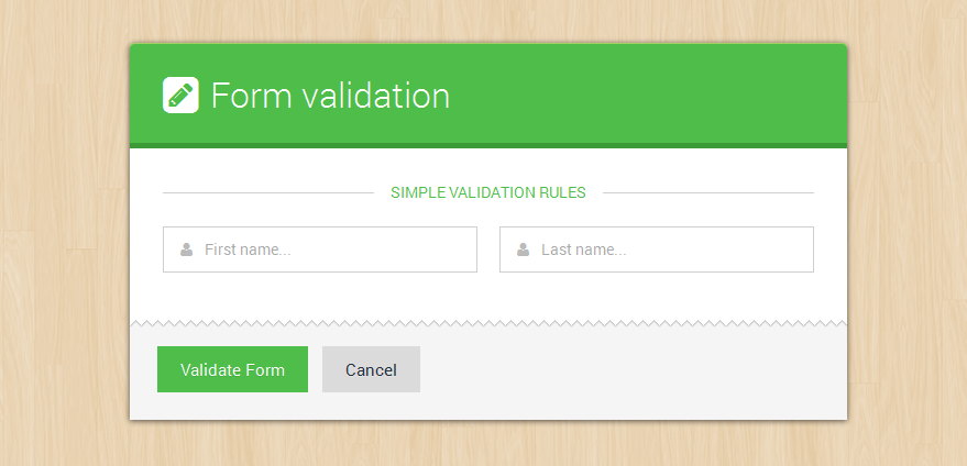
Test form markup looks like this, please notice on the form i added an ID id="contactform":
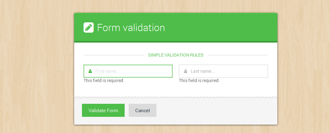
So the $("#contactform") rule above, uses jQuery to select that form, and validate() applies the validation plug-in to the form. However, the form won’t get validated until you specify some validation rules. So first, you'll make the firstname field required which will produce an error message upon validation.
            <form method="post" action="/" id="contactform">

            	<div class="form-body">

                    <div class="spacer-b30">
                    	<div class="tagline"><span> Simple validation rules </span></div><!-- .tagline -->
                    </div>

                    <div class="frm-row">
                        <div class="section colm colm6">
                            <label for="firstname" class="field prepend-icon">
                                <input type="text" name="firstname" id="firstname" class="gui-input required" placeholder="First name...">
                                <span class="field-icon"><i class="fa fa-user"></i></span>
                            </label>
                        </div><!-- end section -->

                        <div class="section colm colm6">
                            <label for="lastname" class="field prepend-icon">
                                <input type="text" name="lastname" id="lastname" class="gui-input required" placeholder="Last name...">
                                <span class="field-icon"><i class="fa fa-user"></i></span>
                            </label>
                        </div><!-- end section -->
                    </div><!-- end .frm-row section -->

                </div><!-- end .form-body section -->
                <div class="form-footer">
                	<button type="submit" class="button btn-primary"> Validate Form </button>
                    <button type="reset" class="button"> Cancel </button>
                </div><!-- end .form-footer section -->

            </form>
I have added a required class (class="gui-input required") on each form input to make the inputs respond to validation:
When you click the validate button the form should bring errors like this in the image below, Don’t worry about the appearance of the error message just yet. You’ll learn how to format error messages later on :
Advanced validation
The files used in the this example are located inside elegant folder > Javacript enhancements > form-validation-tests3.html
The jQuery validation plugin allows us to go beyond the flow with validation, create custom methods, add highlights, custom error messages and placements, there are some things you can’t do with the basic validation methods, like assign different error messages for different validation problems, or require a specific number of characters for input. In these cases, you need to use the Validation plug-in's advanced approach for creating validation rules and error messages.
Lets add some form elements modify our function alittle bit now, intead the new one should look like this
<script type="text/javascript">

    $(function() {

        $("#contactform").validate({

        }); // end validate

    });

</script>
Add opening and closing braces between the parentheses in validate(), add an empty line between the braces, and add a JavaScript comment at the end. The comment is a note to identify the end of the validate() function. You’ll soon be filling the script with braces and parentheses, so it can get tricky to remember which brace goes with what. This comment ( // end validate ) can help keep you from getting confused, but like all comments in code, it’s optional.
Next, you’ll create the basic skeleton for adding validation rules.
<script type="text/javascript">

    $(function() {

        $("#contactform").validate({


        }); // end validate

    });

</script>
Adding rules
<script type="text/javascript">

    $(function() {

       $("#contactform").validate({

            rules: {


            } // end rules

        }); // end validate

    });

</script>
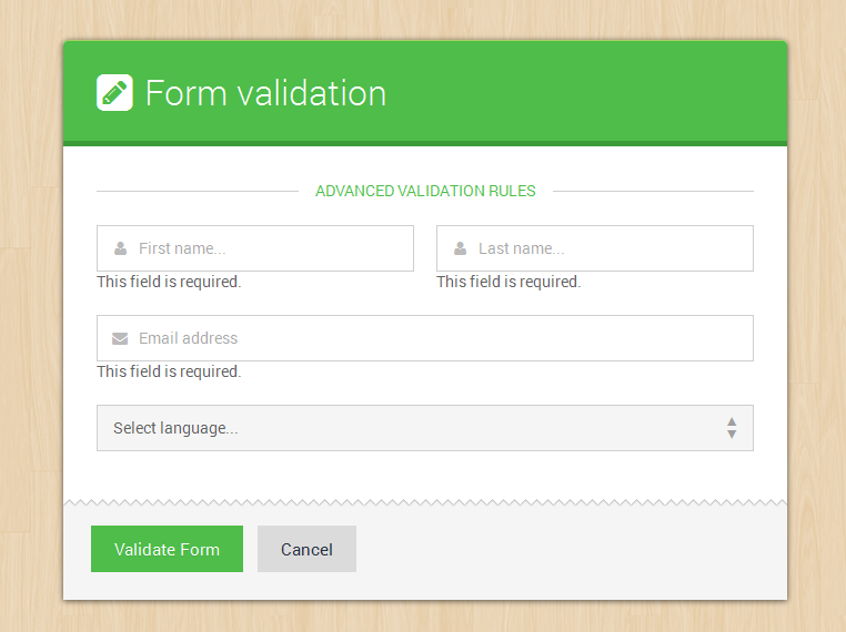
The above code creates an empty object, which you’ll fill with specific field names and validation methods. In addition, a JavaScript comment identifies the end of the rules object. Next, you’ll add rules for the firstname, lastname and useremail fields.
<script type="text/javascript">

    $(function() {

       $("#contactform").validate({

            rules: {
                firstname: {
                    required: true
                },
                lastname: {
                    required: true
                },
                useremail: {
                    required: true,
                    email: true
                }

            } // end rules

        }); // end validate

    });

</script>
NOTE: the validation rule must correspond with the input name attribute like below name="useremail" , thats what we use to write the rule
<input type="email" name="useremail" class="gui-input" >
In the above, we’ve added another object literal. Using the useremail: rule as our example, The first part, useremail:, is the name of the field you wish to validate and matches the field’s name attribute (name="useremail") in the HTML markup shown above. Next, two validation methods are specified—the field is required:true (meaning visitors must fill it in if they want to submit the form), and the input email:true input entry must match the form of an email address.
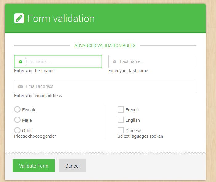
Now when we test our form looks like below: Notice the: This field is required. message below the inputs we shall style that message later to make it red
Adding Messages
The jQuery plugin also allows us to specify our own messages through another object
<script type="text/javascript">

    $(function() {

       $("#contactform").validate({

            rules: {
                firstname: {
                    required: true
                },
                lastname: {
                    required: true
                },
                useremail: {
                    required: true,
                    email: true
                }

            }, // end rules

            messages: {


            } // end messages

        }); // end validate

    });

</script>
The above code represents yet another object literal, named messages. This object will contain any error messages you wish to add to your form fields. Again, the comment at the end — // end messages — is optional. Now you’ll add the actual error messages for our required fields. Please notice that rules ends with a comma because i have added another object below it
<script type="text/javascript">

    $(function() {

       $("#contactform").validate({

            rules: {
                firstname: {
                    required: true
                },
                lastname: {
                    required: true
                },
                useremail: {
                    required: true,
                    email: true
                }

            }, // end rules

            messages: {

                firstname: {
                    required: 'Enter your first name'
                },
                lastname: {
                    required: 'Enter your last name'
                },
                useremail: {
                    required: 'Enter your email address',
                    email: 'Enter a VALID email address'
                }

            } // end messages

        }); // end validate

    });

</script>
The messages actually look like rules, the only exception is that they have words in brackets, you can try any words of your choice there depending on your fields
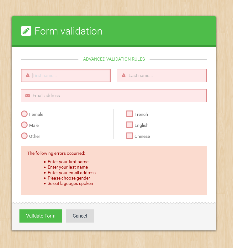
Validating Checkboxes and Radio Options
The files used in the this example are located inside elegant folder > Javacript enhancements > form-validation-tests4.html
The problem with validating checkboxes and radio options
Checkboxes and radio buttons usually come in groups, and typically, adding validation to several checkboxes or radio buttons in a single group is a tricky process of finding all boxes or buttons in a group. Fortunately, the Validation plug-in takes care of the hard parts, and makes it easy for you to quickly validate the form options.
A case for checkboxes and radio buttons
Checkboxes in a group usually share the same name attribute, so the Validation plug-in treats them as a group. In other words, the validation rule applies to all the checkboxes. In essence, for checkboxes in agroup the visitors are required to checkmark AT LEAST ONE checkbox before they can submit the form, however for checkboxes you can checkmark more than one but when one is selected, the rest in the group will be validated automatically...
In a related matter, a group of radio buttons always shares the same name, so even though you’ve added a single rule and error message, it will apply to all the radios in a group. Because the radio field is required, visitors must select ONLY one of the radio buttons to submit the form.
Lets add some check and radio options to our form (test4)
The gender group (female, male, other) are radio buttons, while the languages group (French, English and Chinese) is a checkbox group
Rules for check and radio options
<script type="text/javascript">

    $(function() {

       $("#contactform").validate({

            rules: {
                firstname: {
                    required: true
                },
                lastname: {
                    required: true
                },
                useremail: {
                    required: true,
                    email: true
                },
                gender: {
                    required: true
                },
                languages: {
                    required: true
                }

            }, // end rules

            messages: {

                firstname: {
                    required: 'Enter your first name'
                },
                lastname: {
                    required: 'Enter your last name'
                },
                useremail: {
                    required: 'Enter your email address',
                    email: 'Enter a VALID email address'
                },
                gender: {
                    required: 'Please choose gender'
                },
                languages: {
                    required: 'Select laguages spoken'
                }

            } // end messages

        }); // end validate

    });

</script>
After adding the rules for gender and languages You may notice something looks a bit odd: When the error messages for the checkbox and radio buttons appear, they come directly before the first checkbox and radio button (circled in red below ).
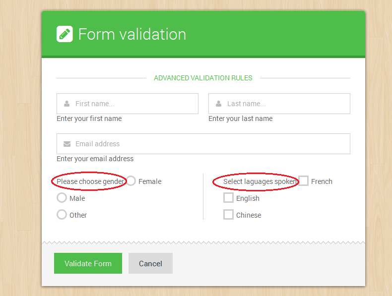
Error placement to the rescue
The Validation plug-in places the error message directly after the form field that you apply the validation rule to. Normally, that’s OK: When the message appears directly after a text field or select drop menu, it looks fine (as in the earlier examples). But in the case of radios and checkboxes, the message should go somewhere else, preferably after all of the checkboxes or radio buttons.
Fortunately, the Validation plug-in has a way to control the placement of error messages. You can create your own rules for error-message placement by passing another object literal to the validate() function.
Locate the validation script you added earlier, and type a comma after the closing brace for the messages object (but before the // end messages comment). Insert a blank line after the messages object, and then type:
<script type="text/javascript">

    $(function() {

       $("#contactform").validate({

            rules: {
                firstname: {
                    required: true
                },
                lastname: {
                    required: true
                },
                useremail: {
                    required: true,
                    email: true
                },
                gender: {
                    required: true
                },
                languages: {
                    required: true
                }

            }, // end rules

            messages: {

                firstname: {
                    required: 'Enter your first name'
                },
                lastname: {
                    required: 'Enter your last name'
                },
                useremail: {
                    required: 'Enter your email address',
                    email: 'Enter a VALID email address'
                },
                gender: {
                    required: 'Please choose gender'
                },
                languages: {
                    required: 'Select laguages spoken'
                }

            }, // end messages

            errorPlacement: function(error, element) {
                if (element.is(":radio") || element.is(":checkbox")) {
                    element.closest('.option-group').after(error);
                } else {
                    error.insertAfter(element.parent());
                }
            } // end error placement

        }); // end validate

    });

</script>
The Validation plug-in is programmed to accept an optional errorPlacement object, which is just an anonymous function that determines where an error message is placed. Every error is sent through this function, so if you only want to change the placement of some error messages, you’ll need to use a conditional statement to identify the form elements whose errors you wish to place. The function receives both the error message and the form element the error applies to, so you can use a conditional statement to check whether the form field is either a radio button of a checkbox. If it is, the error message is added after the element containing the button or checkbox (option-group).
In our forms, we wrap a div around the group of checkboxes, and another div tag wraps the radio buttons with a class (.option-group). So the error message is placed just after the closing div tag using jQuery’s closest() function.
Error styling and element highlighting
The files used in the this example are located inside elegant folder > Javacript enhancements > form-validation-tests5.html
The Validation plug-in has other optional highlight and unhighlight objects which help us to style and highlight errors in more advanced ways, since most elements are wrapped in a a div or label that has a class .field we shall add an error or success class to that element .field so that we can style elemnts form inside that element.
Lastly we shall define our own custom error classes for hghlighting which will help us to style the form elements, and also a custom error element instead of a label, our error element will be an em, we place these before the rules, see our final script below.
<script type="text/javascript">

    $(function() {

       $("#contactform").validate({

            errorClass: "state-error",
            validClass: "state-success",
            errorElement: "em",

            rules: {
                firstname: {
                    required: true
                },
                lastname: {
                    required: true
                },
                useremail: {
                    required: true,
                    email: true
                },
                gender: {
                    required: true
                },
                languages: {
                    required: true
                }

            }, // end rules

            messages: {

                firstname: {
                    required: 'Enter your first name'
                },
                lastname: {
                    required: 'Enter your last name'
                },
                useremail: {
                    required: 'Enter your email address',
                    email: 'Enter a VALID email address'
                },
                gender: {
                    required: 'Please choose gender'
                },
                languages: {
                    required: 'Select laguages spoken'
                }

            }, // end messages

            highlight: function(element, errorClass, validClass) {
                $(element).closest('.field').addClass(errorClass).removeClass(validClass);
            }, // end highlight

            unhighlight: function(element, errorClass, validClass) {
                $(element).closest('.field').removeClass(errorClass).addClass(validClass);
            }, // end unhighlight

            errorPlacement: function(error, element) {
                if (element.is(":radio") || element.is(":checkbox")) {
                    element.closest('.option-group').after(error);
                } else {
                    error.insertAfter(element.parent());
                }
            } // end error placement

        }); // end validate

    });

</script>
Show all errors in one div
You can place all errors in one single place inside a container like a DIV or a section by adjusting the error placement section
THE JAVASCRIPT CHANGES
<script type="text/javascript">

    $(function() {

       $("#contactform").validate({

            errorClass: "state-error",
            validClass: "state-success",
            errorElement: "em",

            rules: {
                firstname: {
                    required: true
                },
                lastname: {
                    required: true
                },
                useremail: {
                    required: true,
                    email: true
                },
                gender: {
                    required: true
                },
                languages: {
                    required: true
                }

            }, // end rules

            messages: {

                firstname: {
                    required: 'Enter your first name'
                },
                lastname: {
                    required: 'Enter your last name'
                },
                useremail: {
                    required: 'Enter your email address',
                    email: 'Enter a VALID email address'
                },
                gender: {
                    required: 'Please choose gender'
                },
                languages: {
                    required: 'Select laguages spoken'
                }

            }, // end messages
            invalidHandler: function(form, validator) {
                $(".errorsContainer").show();
            },
            highlight: function(element, errorClass, validClass) {
                $(element).closest('.field').addClass(errorClass).removeClass(validClass);
                if (this.numberOfInvalids() > 0) {
                    $(".errorsContainer").show();
                }
            },
            unhighlight: function(element, errorClass, validClass) {
                $(element).closest('.field').removeClass(errorClass).addClass(validClass);
                if (this.numberOfInvalids() == 0) {
                    $(".errorsContainer").hide();
                }
            },
            errorPlacement: function(error, element) {
                error.appendTo("#smartErrors");
            }

        }); // end validate

    });

</script>
THE HTML MARKUP CHANGES
Add this markup anywhere on your form where you want the errors to be placed
<!-- custom errors will load here  -->
<div class="notification alert-error errorsContainer">
    <p>The following errors occurred:</p>
    <ul id="smartErrors">

    </ul>
</div>
Formating Success and Error states with css
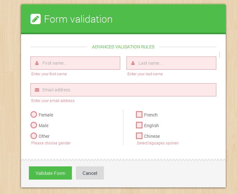
Now the page has working form validation, but the error messages don’t look very good. Not only are they spread around the page, but they don’t stand out the way they should. They’d look a lot better if they were bold, red, and appeared underneath the form field they apply to. You can make all of those formatting changes with a little simple CSS.
The CSS properties themselves are pretty basic: First, the font size is reduced, next, the color is changed to red, the inputs are given a red border and red background color. The display: block instruction informs the browser to treat the em tag after the element with an error class as a block-level element. That is, instead of putting the error message next to the form field, the browser treats the error like a paragraph of its own, with line breaks above and below.
Below are the full css rules that make all that possible
    /* @validaion - error state
    ------------------------------------- */
    .smart-forms .state-error .gui-input,
    .smart-forms .state-error .gui-textarea,
    .smart-forms .state-error.select > select,
    .smart-forms .state-error.select-multiple > select,
    .smart-forms .state-error input:hover + .checkbox,
    .smart-forms .state-error input:hover + .radio,
    .smart-forms .state-error input:focus + .checkbox,
    .smart-forms .state-error input:focus + .radio,
    .smart-forms .state-error .checkbox,
    .smart-forms .state-error .radio{
        background:#FEE9EA;
        border-color:#DE888A;
    }

    .smart-forms .state-error .gui-input:focus,
    .smart-forms .state-error .gui-textarea:focus,
    .smart-forms .state-error.select > select:focus,
    .smart-forms .state-error.select-multiple > select:focus{
        -webkit-box-shadow:0px 0px 3px #DE888A inset;
        -moz-box-shadow:0px 0px 3px #DE888A inset;
        -o-box-shadow:0px 0px 3px #DE888A inset;
        box-shadow:0px 0px 3px #DE888A inset;
    }

    .smart-forms .state-error .gui-input ~ .field-icon i,
    .smart-forms .state-error .gui-textarea ~ .field-icon i{  color: #DE888A; }
    .smart-forms .state-error.select .arrow { color: #DE888A; }
    .smart-forms .state-error.select > select:focus + .arrow{ color:#DE888A; }
    .smart-forms .state-error .gui-input ~ .input-hint,
    .smart-forms .state-error.file .gui-file:hover + .gui-input,
    .smart-forms .state-error .gui-textarea ~ .input-hint { border-color:#DE888A; }
    .smart-forms .state-error + em{
        display: block!important;
        margin-top: 6px;
        padding: 0 3px;
        font-family:Arial, Helvetica, sans-serif;
        font-style: normal;
        line-height: normal;
        font-size:0.85em;
        color:#DE888A;
    }

    /* @validaion - success state
    -------------------------------------------------- */
    .smart-forms .state-success .gui-input,
    .smart-forms .state-success .gui-textarea,
    .smart-forms .state-success.select > select,
    .smart-forms .state-success.select-multiple > select,
    .smart-forms .state-success input:hover + .checkbox,
    .smart-forms .state-success input:hover + .radio,
    .smart-forms .state-success input:focus + .checkbox,
    .smart-forms .state-success input:focus + .radio,
    .smart-forms .state-success .checkbox,
    .smart-forms .state-success .radio{
        background:#F0FEE9;
        border-color:#A5D491;
    }

    .smart-forms .state-success .gui-input:focus,
    .smart-forms .state-success .gui-textarea:focus,
    .smart-forms .state-success.select > select:focus,
    .smart-forms .state-success.select-multiple > select:focus{
        -webkit-box-shadow:0px 0px 3px #A5D491 inset;
        -moz-box-shadow:0px 0px 3px #A5D491 inset;
        -o-box-shadow:0px 0px 3px #A5D491 inset;
        box-shadow:0px 0px 3px #A5D491 inset;
    }

    .smart-forms .state-success .gui-input ~ .field-icon i,
    .smart-forms .state-success .gui-textarea ~ .field-icon i{  color: #A5D491; }
    .smart-forms .state-success.select .arrow { color: #A5D491; }
    .smart-forms .state-success.select > select:focus + .arrow{ color:#A5D491; }
    .smart-forms .state-success.select:before {  border-left:1px solid #A5D491; }
    .smart-forms .state-success .gui-input ~ .input-hint,
    .smart-forms .state-success.file .gui-file:hover + .gui-input,
    .smart-forms .state-success .gui-textarea ~ .input-hint { border-color:#A5D491; }
Form input Masking
Unlike Validation masking targets a given input selector, which can be a class or ID, it is usually better to use ID selectors for masking, some rules are listed below
<script type="text/javascript">

    $(function() {

        $("#telephone").mask('(999) 999-999999', {placeholder:'X'});
        $("#zipcode").mask('99999', {placeholder:'X'});
        $("#dates").mask('99/99/9999', {placeholder:'X'});
        $("#serial").mask('***-****-****-****', {placeholder:'_'});

    });

</script>
Javascript Input Widgets
Some widgets are powered by JQuery Plugins, these include date pickers, sliders, numeric steppers, month pickers, time pickers, colorpickers. Here is a breakdowm of their respective markup and Javascript
Date Picker
Date picker helps us to easily choose date or date ranges! It is poweered by a smaller custom build of the jQuery UI Library
Include these scripts in the head section of your document
<script type="text/javascript" src="js/jquery-1.9.1.min.js"></script>
<script type="text/javascript" src="js/jquery-ui-custom.min.js"></script>
Create the HTML markup for the datepicker (Usually an input type text)
<div class="section">
    <label class="field">
        <input type="text" name="datepicker1" id="datepicker1" class="gui-input">
    </label>
</div><!-- end section -->
Then call the datepicker with the desired settings, just below the top scripts added
<script type="text/javascript">

    $(function() {

        $("#datepicker1").datepicker({
            numberOfMonths: 1,
            prevText: '<i class="fa fa-chevron-left"></i>',
            nextText: '<i class="fa fa-chevron-right"></i>',
            showButtonPanel: false
        });

    });

</script>
Change Date Format
By default the date format starts with the ("mm/dd/yy") - Month / Day / Year However this can be changed using the date format option to something like Year / Moth / day by adding this option - dateFormat: "yy-mm-dd"
Simply add a date format option to the picker - for example to start with the day - Month - year do this:
<script type="text/javascript">

    $(function() {

        $("#datepicker1").datepicker({
            dateFormat: 'dd-mm-yy',
            numberOfMonths: 1,
            prevText: '<i class="fa fa-chevron-left"></i>',
            nextText: '<i class="fa fa-chevron-right"></i>',
            showButtonPanel: false
        });

    });

</script>
If you want more date formatting option visit - http://api.jqueryui.com/datepicker/#option-dateFormat
For other calandar options please take a look at the widget-datepicker-options.html
Inline Date Picker
For Inline Date pickers just hook the picker to the div element instead of an input so the markup will be like so:
<div class="section cal-widget">
	<div class="inline-calender"></div>
</div>
Then iitialize the JS like so, don't repeat the $(function(){ }); in case you have multiple pickers
<script type="text/javascript">

    $(function() {

        $(".inline-calender").datepicker({
            numberOfMonths: 1,
            prevText: '<i class="fa fa-chevron-left"></i>',
            nextText: '<i class="fa fa-chevron-right"></i>'
        });

    });

</script>
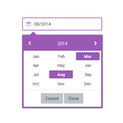
Month Picker
Month picker extends the UI Date picker - to depict months and years
Add the month picker extension script to the already added datepicker scripts in the head section of your document
<script type="text/javascript" src="js/jquery-1.9.1.min.js"></script>
<script type="text/javascript" src="js/jquery-ui-custom.min.js"></script>
<script type="text/javascript" src="js/jquery-ui-monthpicker.min.js"></script>
Create the HTML markup for the Month Picker its hooked to an input type text - no support for the inline version
<div class="section">
    <label class="field">
    	<input type="text" name="month-picker1" id="month-picker1" class="gui-input">
    </label>
</div><!-- end section -->
Then call the Monthpicker with the desired settings, just below the top scripts added
<script type="text/javascript">

    $(function() {
        $("#month-picker1").monthpicker({
            changeYear: false,
            stepYears: 1,
            prevText: '<i class="fa fa-chevron-left"></i>',
            nextText: '<i class="fa fa-chevron-right"></i>',
            showButtonPanel: true
        });
    });

</script>
Time Picker
The Time picker extends the UI Date picker - to depict time
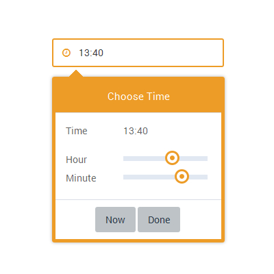
Add the time picker extension script to the already added datepicker scripts in the head section of your document
The add the touch punch extension since the time picker uses the sider you will need to support dragging the slider pointer on touch devices
<script type="text/javascript" src="js/jquery-1.9.1.min.js"></script>
<script type="text/javascript" src="js/jquery-ui-custom.min.js"></script>
<script type="text/javascript" src="js/jquery-ui-timepicker.min.js"></script>
<script type="text/javascript" src="js/jquery-ui-touch-punch.min.js"></script>
Create the HTML markup for the time picker its hooked to an input type text it also support the inline version being hooked on to the datepicker widget
<div class="section">
    <label class="field">
    	<input type="text" name="timepicker1" id="timepicker1" class="gui-input">
    </label>
</div><!-- end section -->
Then call the Time picker with the desired settings, just below the top scripts added
We first create a variable var smartpickerWrapper that stores our wrapper, we shall call it on beforeShow: this means that before the timepicker shows, we wrap it around our created variable, then when the datepicker / timepicker closes onClose: we remove our wrapper completely from DOM to prevent it adding more DOM elements in case another picker is opened. Infact if you are reading this manual for learning purposes, we can use a similar technique to create multiple themed datepickers / timepickers / monthpickers on the same page!
<script type="text/javascript">

$(function() {

	var smartpickerWrapper = '<div class="smart-forms"><div class="yellow-slider"></div></div>';

        $('#timepicker1').timepicker({
            beforeShow: function(input, inst) {
                   inst.dpDiv.unwrap().unwrap(smartpickerWrapper);
                   var smartpikr = inst.dpDiv.parent();
                   if (!smartpikr.hasClass('smart-forms')){
                       inst.dpDiv.wrap(smartpickerWrapper);
                   }
        	},
                onClose: function(input, inst) {
                    inst.dpDiv.unwrap().unwrap(smartpickerWrapper);
                }
	});


});

</script>
Date Time Picker
The Scripts are the same as for the timepicker only the initialization changes instead of $('#selector').timepicker we use $('#selector').datetimepicker, the rest is normal stuff!
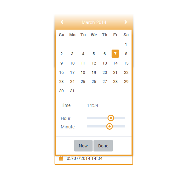
Initialize it like so
<script type="text/javascript">

$(function() {

	var smartpickerWrapper = '<div class="smart-forms"><div class="yellow-slider"></div></div>';

       $('#dtimepicker1').datetimepicker({
		prevText: '<i class="fa fa-chevron-left"></i>',
		nextText: '<i class="fa fa-chevron-right"></i>',
                beforeShow: function(input, inst) {
                       inst.dpDiv.unwrap().unwrap(smartpickerWrapper);
                       var smartpikr = inst.dpDiv.parent();
                       if (!smartpikr.hasClass('smart-forms')){
                           inst.dpDiv.wrap(smartpickerWrapper);
                       }
                },
                onClose: function(input, inst) {
                 	inst.dpDiv.unwrap().unwrap(smartpickerWrapper);
                }
	});


});

</script>
Color Picker and Numeric Stepper Widgets
The following styles are required for both these widgets to work
<link rel="stylesheet" type="text/css"  href="css/smart-forms.css">
<link rel="stylesheet" type="text/css"  href="css/smart-addons.css">
The Numeric Stepper

1 - Add the required Javascript files (stepper plugin + The jQuery Library)
<script type="text/javascript" src="js/jquery-1.9.1.min.js"></script>
<script type="text/javascript" src="js/jquery.stepper.min.js"></script>
2 - Create the HTML markup for the numeric stepper ( usually an input type text )
<label class="field">
	<input type="text" name="stepper" id="stepper" class="gui-input">
</label>
3 - Initialize it with Js - And done!
<script type="text/javascript">
    $(function() {

        $('#stepper').stepper();

    });
</script>
4 - Oh May be set some options
<script type="text/javascript">
    $(function() {

	$('#stepper4').stepper({
                UI: false,
                allowWheel :false,
                limit: [0, 10],
                wheel_step: 1,
                arrow_step: 0.2
	});

    });
</script>
Color Picker
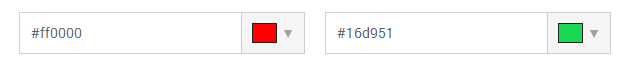
1 - Add the required Javascript files (spectrum color plugin + The jQuery Library)
<script type="text/javascript" src="js/jquery-1.9.1.min.js"></script>
<script type="text/javascript" src="js/jquery.spectrum.min.js"></script>
2 - Create the HTML markup for the colorpicker ( usually an input type text )
Important note: all enclosing field labels should include the class sfcolor - see example markup below!
<label class="field sfcolor">
	<input type="text" name="colorpicker1" id="colorpicker1" class="gui-input">
</label>
3 - Initialize it with Js - And done!
<script type="text/javascript">
    $(function() {

            $("#colorpicker1").spectrum({
                    color: "#FCD208"
            });

            $("#colorpicker1").show();

    });
</script>
4 - Oh May be set some options as well
<script type="text/javascript">
    $(function() {

            $("#colorpicker1").spectrum({
                    color: "#FCD208",
                    showInput: true,
                    showPalette: true,
                    showAlpha: true
            });

    });
</script>
UI Auto complete
1 - Create the HTML markup for the autocomplete ( usually an input type text )
<label class="field">
	<input type="text" name="countryList" id="countryList" class="gui-input" placeholder="Enter Country">
</label>
2 - Initialize it with the widget
<script type="text/javascript">
    $(function() {
		$(function(){

			var countryTags = [
				"Albania",
				"Algeria",
				"Andorra",
				"Angola",
				"Australia",
				"Austria",
				"Bahamas",
				"Bahrain",
				"Bangladesh",
				"Barbados",
				"Belarus",
				"Belgium",
				"Belize",
				"Benin",
				"Botswana",
				"Brazil",
				"Burma",
				"Burundi",
				"Cambodia",
				"Cameroon",
				"Canada",
				"Chad",
				"Chile",
				"China",
				"Colombia",
				"Comoros",
				"Congo"
			];
			$( "#countryList" ).autocomplete({
				source: countryTags
			});

    });
</script>
3 - Using Autocomplete with AJAX / JSON Data
<script type="text/javascript">
$(function() {
    $('#selector').autocomplete({
        source: function( request, response ) {
            $.ajax({
                dataType: "json",
                type : 'Get',
                url: '/path/to/autocomplete.php',
                success: function(data) {
                    $('#selector').removeClass('ui-autocomplete-loading');
                    response( $.map( data, function(item) {

                    }));
                },
                error: function(data) {
                    $('#selector').removeClass('ui-autocomplete-loading');
                }
            });
        },
        minLength: 3,
        open: function(){
        },
        close: function(){
        },
        focus:function(event,ui){
        },
        select: function( event, ui ) {
        }
    });
});
</script>
UI Combobox
Combobox uses the following plugins
<script src="js/jquery-1.9.1.min.js"></script>
<script src="js/jquery-ui-custom.min.js"></script>
<script src="js/jquery-ui-combo.min.js"></script>
The markup for the UI Combobox uses a hidden select element and an input
<script type="text/javascript">
    $(function() {
        $("#combobox1").combobox();
    });
</script>
<div class="section">
    <label for="combobox1" class="field-label">Basic Combobox </label>
    <label class="field">
        <select id="combobox1" data-cb-widget-placeholder="Select one...">
            <option value="">Select one...</option>
            <option value="ActionScript">ActionScript</option>
            <option value="AppleScript">AppleScript</option>
            <option value="Asp">Asp</option>
            <option value="BASIC">BASIC</option>
            <option value="C">C</option>
            <option value="C++">C++</option>
            <option value="Clojure">Clojure</option>
            <option value="COBOL">COBOL</option>
            <option value="ColdFusion">ColdFusion</option>
            <option value="Erlang">Erlang</option>
            <option value="Fortran">Fortran</option>
            <option value="Groovy">Groovy</option>
            <option value="Haskell">Haskell</option>
            <option value="Java">Java</option>
            <option value="JavaScript">JavaScript</option>
            <option value="Lisp">Lisp</option>
            <option value="Perl">Perl</option>
            <option value="PHP">PHP</option>
            <option value="Python">Python</option>
            <option value="Ruby">Ruby</option>
            <option value="Scala">Scala</option>
            <option value="Scheme">Scheme</option>
        </select>
    </label>
</div><!-- end section -->
UI Combobox validation and setting the input NAME and ID
The combobox uses an INPUT and for searching and a SELECT that holds the data but by default the input has no ID and NAME attributes so i added some data attributes that can help us to set the PLACEHOLDER via data-cb-widget-placeholder="Placeholder text..." INPUT CUSTOM ID data-cb-widget-id="INPUT-CUSTOM-ID" INPUT CUSTOM NAME data-cb-widget-name="INPUT-CUSTOM-NAME"
So to validate the the COMBOBOX INPUT use the INPUT-CUSTOM-NAME
Currecies and numbers formatting widget
You must use an input type TEXT for this widget as other INPUT TYPES are limited in support - see form-numbers-currencies.html for more details
Modal Popup form
1 - Create the HTML markup for form
The markup for the modal form has been modified alittle bit now the form uses an ID which matches the data attribute in your link this helps us to support multiple popups on the same page! Include jquery-1.9.1.min.js and smartforms-modal.min.js scripts below
<script src="js/jquery-1.9.1.min.js"></script>
<script src="js/smartforms-modal.min.js"></script>
    <!-- FORM TRIGGER BUTTON -->
    <div class="smartforms-px">
    	<a href="#" data-smart-modal="#myForm" class="smartforms-modal-trigger">Show Modal Form</a>
    </div>

    <div id="myForm" class="smartforms-modal" role="alert">
        <div class="smartforms-modal-container">

            <div class="smartforms-modal-header">
                <h3>Contact Form</h3>
                <a href="#" class="smartforms-modal-close">×</a>
            </div><!-- .smartforms-modal-header -->

            <div class="smartforms-modal-body">
                <div class="smart-wrap">
                    <div class="smart-forms smart-container wrap-full">
                        <div class="form-body">
                            <form method="post" action="" id="smart-form">


                                <!-- ALL FORM MAKUP GOES HERE -->

                                <!-- THIS IS THE SUBMIT BUTTON -->
                                <div class="smartforms-modal-footer">
                                    <button type="submit" class="button btn-primary"> Send Form </button>
                                    <button type="reset" class="button"> Cancel </button>
                                </div><!-- end .form-footer section -->

                            </form>
                        </div><!-- end .form-body section -->
                    </div><!-- end .smart-forms section -->
                </div><!-- end .smart-wrap section -->
            </div><!-- .smartforms-modal-body -->
        </div><!-- .smartforms-modal-container -->
    </div><!-- .smartforms-modal -->
Automatically show or close the modal popup form
You add a class smartforms-autoshow to smartforms-modal container and to add AUTO SHOW timing in seconds - use data-smartforms-autoshow-duration="5" and to add AUTO CLOSE data-smartforms-autoclose-duration="10" like below
<div id="myForm" class="smartforms-modal smartforms-autoshow" data-smartforms-autoshow-duration="5" data-smartforms-autoclose-duration="10" role="alert">

</div><!-- .smartforms-modal -->
Multi-steps form
1 - Create the HTML markup for the steps form
<div class="smart-wrap">
    <div class="smart-forms smart-container wrap-1">

        <div class="form-body stp-two">
            <form method="post" id="smart-form">
                <h2>Your Details</h2>
                <fieldset>

                    <!-- STEP 2 HTML MARKUP GOES HERE-->

                </fieldset>

                <h2>Project Details</h2>
                <fieldset>

                    <!-- STEP 2 HTML MARKUP GOES HERE-->

                </fieldset>
            </form>
        </div><!-- end .form-body section -->

    </div><!-- end .smart-forms section -->
</div><!-- end .smart-wrap section -->
The Class .stp-two represents the number of steps you can add upto 6 steps using .stp-two, .stp-three, .stp-four, .stp-five, .stp-six
2 - The Javascript for the steps form
<script type="text/javascript" src="js/jquery-1.9.1.min.js"></script>
<script type="text/javascript" src="js/jquery.steps.min.js"></script>
3 - Initialize the steps form
IMPORTANT - I have noticed that sometimes the steps plugin conflicts with some javascript libraries such as jQuery UI so load the steps plugin first then load other libraries and this includes initializing the library also
<script type="text/javascript">
    $("#smart-form").steps({
        headerTag: "h2",
        bodyTag: "fieldset",
        transitionEffect: "slideLeft",
        stepsOrientation: "vertical",
        autoFocus: true,
        labels: {
            finish: "Submit Form",
            next: "Continue",
            previous: "Go Back",
            loading: "Loading..."
        }
    });

    /* Initialize other plugins after steps here */
</script>
Smart Steps and Progress Bars
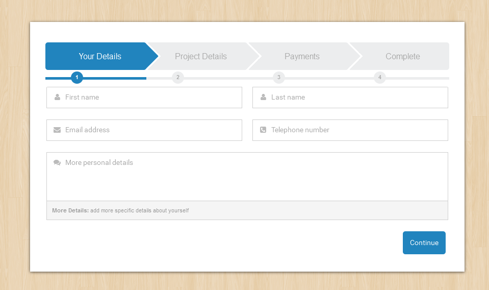
    <div class="form-body smart-steps steps-progress stp-two">

    </div><!-- end .form-body section -->
The CLASS .smart-steps adds pointed steps while the CLASS .steps-progress adds the progress bar below the steps
Vertical Steps
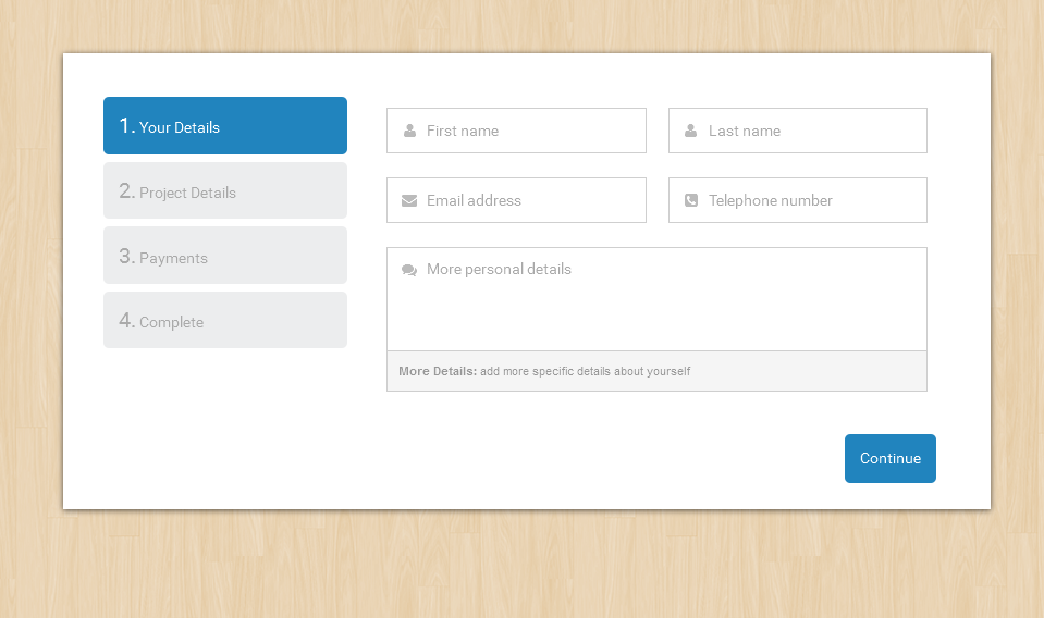
Steps Events, Methods, Validation
The areas with comments indicate places where you can place your code for a method in case you need to do an action for exaple before atep is changed, when its cahnging or even when all the steps are done...
<script type="text/javascript">
    $(function(){
        $("#smart-form").steps({
            headerTag: "h2",
            bodyTag: "fieldset",
            transitionEffect: "slideLeft",
            stepsOrientation: "vertical",
            autoFocus: true,
            labels: {
                finish: "Submit Form",
                next: "Continue",
                previous: "Go Back",
                loading: "Loading..."
            },
            onStepChanging: function (event, currentIndex, newIndex){

                /* WHEN CHANGING A STEP */

            },
            onStepChanged: function (event, currentIndex, priorIndex){

                /* AFTER CHANGING A STEP */

            },
            onFinishing: function (event, currentIndex){

                /* WHEN COMPLETING CHANGING A STEP */
            },
            onFinished: function (event, currentIndex){

                /* AJAX SUBMIT HANDLER GOES HERE */
            }
        }).validate({
            rules: {

                /* VALIDATION RULES GO HERE */
            },
            messages: {

                /* VALIDATION MESSAGES GO HERE */
            },
            highlight: function(element, errorClass, validClass) {
                $(element).closest('.field').addClass(errorClass).removeClass(validClass);
            },
            unhighlight: function(element, errorClass, validClass) {
                $(element).closest('.field').removeClass(errorClass).addClass(validClass);
            },
            errorPlacement: function(error, element) {
                if (element.is(":radio") || element.is(":checkbox")) {
                    element.closest('.option-group').after(error);
                } else {
                    error.insertAfter(element.parent());
                }
            }
        });
    });
</script>
Steps forms themes
You can add a theme to match the form colors by adding the theme class steps-theme-primary to form-body, there are themes to match all the color themes available in smart-forms for example steps-theme-red, steps-theme-blue, steps-theme-green, steps-theme-black, steps-theme-purple, steps-theme-yellow, steps-theme-primary
    <div class="form-body smart-steps steps-progress stp-two steps-theme-primary">

    </div><!-- end .form-body section -->
Chained Selects
You can create chained select elements by using the jquery.chained.min.js plugin
Chaining involves two methods namely
1 - CHAINING METHOD 1: Using CSS Classes
Child selects are chained to parent select. All selects must have an id attribute. Child select options must have class names which match option values of parent select. When user selects something in parent select the options in child select are updated. Options which have matching classname with parents currently selected option will stay visible. Others are hidden.
Lets assume you have a list of COMPANIES and you want to show their PRODUCTS each company its own products once you select it from the list
THE COMPANY LIST SELECT MARKUP
<select id="company" name="company">
    <option value="">Select </option>
    <option value="apple">Apple</option>
    <option value="microsoft">Microsoft</option>
    <option value="samsung">Samsung</option>
</select>
THE COMPANY PRODUCT LIST SELECT MARKUP
<select id="products" name="products">
    <option value="">Select </option>
    <option value="iphone" class="apple">iPhone 6</option>
    <option value="surface" class="microsoft">Microsoft Surface</option>
    <option value="galaxys6" class="samsung">Samsung Galaxy S6</option>
</select>
What we have don in the markup above is to connect the two selects COMPANY and PRODUCTS using classes ON PRODUCT VALUES that match values on the COMPANY LIST
The jQuery to connect the chain: initialize the connection
    <script type="text/javascript">
        $(function(){
        	$("#products").chained("#company");
        });
    </script>
Chaining to multiple parents
One child can have two parents. Available options in child which chained to multiple parents depend on one or both of the parents selected values. To make child select depend on values of both parents use classname like first\second.
Consider the selects below
<select id="mark" name="mark">
    <option value="">--</option>
    <option value="bmw">BMW</option>
    <option value="audi">Audi</option>
</select>
<select id="series" name="series">
    <option value="">--</option>
    <option value="series-3" class="bmw">3 series</option>
    <option value="series-5" class="bmw">5 series</option>
    <option value="series-6" class="bmw">6 series</option>
    <option value="a3" class="audi">A3</option>
    <option value="a4" class="audi">A4</option>
    <option value="a5" class="audi">A5</option>
</select>
Here is code for Third select. Note how diesel engine is available only for BMW 3 and 5 series Sedans. This is achieved by using classnames series-3\sedan and series-5\sedan.
<select id="engine" name="engine">
    <option value="">--</option>
    <option value="25-petrol" class="series-3 a3 a4">2.5 petrol</option>
    <option value="30-petrol" class="series-3 series-5 series-6 a3 a4 a5">3.0 petrol</option>
    <option value="30-diesel" class="series-3\sedan series-5\sedan a5">3.0 diesel</option>
</select>
Finally the JS
    <script type="text/javascript">
        $(function(){
            $("#series").chained("#mark");
            $("#model").chained("#series");
            $("#engine").chained("#series, #model");
        });
    </script>
2 - CHAINING METHOD 2: Using AJAX / JSON / PHP
We shall use our examples above but modify the PRODUCTS select to remove the options since we shall be fetching them from an external data source AJAX / JSON / PHP
MODIFICATIONS TO THE PRODUCT LIST SELECT MARKUP
<select id="products" name="products">
    <option value="">Select </option>

</select>
CREATING OUR PHP / JSON FILE
<?php

if (isset($_GET["smartload"])) {
    sleep(1);
}

header("Access-Control-Allow-Origin: *");

$response[""] = "--";

/* Companies and corresponding products details data
-------------------------------------------------------- */
if (isset($_GET["company"])) {
    if ("apple" == $_GET["company"]) {
        $response[""]     = "Apple products";
        $response["iphone"] = "iPhone 6";
    };

    if ("microsoft" == $_GET["company"]) {
        $response[""] = "Microsoft products";
        $response["surface"] = "Microsoft Surface";
    };

    if ("samsung" == $_GET["company"]) {
        $response[""] = "Samsung products";
        $response["galaxys6"] = "Samsung Galaxy S6";
    };
}

print json_encode($response);
?>
save that file as a PHP file mine i saved it as selectData.php and call it like this
    <script type="text/javascript">
        $(function(){
            $("#products").remoteChained({
                parents : "#company",
                url : "selectData.php?smartload=1",
                loading : "loading products...."
            });
        });
    </script>
Clone form elements
You can clone form elements either single / group or even nested elements on forms
1 - Prepare markup for cloning elements
The cloning plugin must be invoked on a wrapper with the clonable items as children. It automatically recognizes this markup, by default - except the clone-wrapper which can be an ID or a CLASS
<div class="clone-wrapper">
    <div class="toclone clone-widget">
        <!-- PLACE ELEMENTS to clone go hereTO CLONE HERE  -->
        <a href="#" class="clone button"><i class="fa fa-plus"></i></a>
        <a href="#" class="delete button"><i class="fa fa-minus"></i></a>
    </div>
</div>
    <script type="text/javascript">
        $(function(){
        	$('.clone-wrapper').cloneya();
        });
    </script>
You can setup some options as well with the cloning plugin
    <script type="text/javascript">
        $(function(){
            $('.clone-wrapper').cloneya({
                minimum         : 1,
                maximum         : 999,
                cloneThis       : '.toclone',
                valueClone      : false,
                dataClone       : false,
                deepClone       : false,
                cloneButton     : '.clone',
                deleteButton    : '.delete',
                clonePosition   : 'after',
                serializeID     : true,
                ignore              : 'label.error',
                preserveChildCount  : false
            });
        });
    </script>
Notice that the markup should be an array with square brackets - notice name="users[]" in the markup below
<input type="text" name="users[]" id="users" class="gui-input" placeholder="Add new user">
When you add the square brackets and clone the elements it becomes easy to POST process the values using simple PHP for example to process all the name="users[]" fields that will be cloned with PHP you do something like this below
    $users = $_POST['users'];
    foreach($users as $value){
    	$users_list = implode( '<br/>', $users);
    }
You can then ECHO $users_list to POST all the values
Show hide form elements
You can show and hide form sections conditionally using checkboxes, radio buttons as well as selects this is how it works
1 - Create a checkbox or radio or select
USING A RADIO OR CHECKBOX
Create a radio button or checkbox and give it a class .smartfm-ctrl and a data-URI with and id of your own choice since we shall use that ID to control the elements E.G data-show-id="ctr_personal"
    <input type="radio" name="package" class="smartfm-ctrl" value=""  data-show-id="ctr_personal">
    <input type="radio" name="other" class="smartfm-ctrl" value=""  data-show-id="show_other">
    <input type="checkbox" name="xboxes" value="Success" class="smartfm-ctrl" data-show-id="box_success">
The above radio will be used to control (SHOW or HIDE) a div or any element with an ID ctr_personal like in the example below
    <div id="ctr_personal" class="hiddenbox"></div>
    <div id="show_other" class="hiddenbox"></div>
    <div id="box_success" class="hiddenbox"></div>
2 - Initalize the plugin
    <script type="text/javascript">
        $(function(){
        	$('.smartfm-ctrl').formShowHide();
        });
    </script>
3 - Clear / Reset fields to default state when hidden
Initialize the plugin with the reset class option added like in the code below
<script type="text/javascript">
    $(function(){
        $('.smartfm-ctrl').formShowHide({
        	resetClass: 'smartform-reset'
        });
    });
</script>
Then use the class smartform-reset on every container with hidden elements for example in the example below the class is added on every hiddenbox to reset / restore the elements to their original state especially child elements like selects, radios and checkboxes which were once selected but later changed and became hidden again!
    <div id="ctr_personal" class="hiddenbox smartform-reset"></div>
    <div id="show_other" class="hiddenbox smartform-reset"></div>
    <div id="box_success" class="hiddenbox smartform-reset"></div>
Google Map
1 - Add the required google map javascript files
<script type="text/javascript" src="https://maps.googleapis.com/maps/api/js?v=3.exp&sensor=false"></script>
2 - Initialize the google map
<script type="text/javascript">
    function initialize() {
        var mapOptions = {
            zoom: 10,
            center: new google.maps.LatLng(29.760193, -95.369390),
            mapTypeId: google.maps.MapTypeId.ROADMAP
        };

        var map = new google.maps.Map(document.getElementById('map_canvas'), mapOptions);
        var marker = new google.maps.Marker({
            map: map,
            draggable: false,
            position: new google.maps.LatLng(29.760193, -95.369390)
        });
    }
    google.maps.event.addDomListener(window, 'resize', initialize);
    google.maps.event.addDomListener(window, 'load', initialize);
</script>
3 - Set the longtude and Latitude coordinates, look for these values in the above code LatLng(29.760193, -95.369390) then change them to your location values
4 - Add the map HTML markup - Just add these lines below to where you want the map to appear
<div class="map-container">
	<div id="map_canvas"></div>
</div>
JQUERY KNOB
1 - Add the required javascript files
<script type="text/javascript" src="js/jquery-1.9.1.min.js"></script>
<script type="text/javascript" src="js/jquery.knob.min.js"></script>
2 - Initialize the knob
    <script type="text/javascript">
        $(function(){
        	$(".knob").knob();
        });
    </script>
4 - Add the HTML markup for the knob
<label class="field">
	<input type="text" class="gui-input knob" data-width="100%" data-height="100%" value="75">
</label>
JQUERY AUTOTAB
1 - Add the required javascript files
<script type="text/javascript" src="js/jquery-1.9.1.min.js"></script>
<script type="text/javascript" src="js/jquery.autotab.min.js"></script>
2 - Initialize the plugin
    <script type="text/javascript">
        $(function(){
            $('.number').autotab();
            $('.dataAttr').autotab();
        });
    </script>
3 - Add the input HTML markup
<label class="field">
	<input type="text" id="number1" class="gui-input number" maxlength="3" placeholder="256">
</label>
<label class="field">
	<input type="text" id="number2" class="gui-input number" maxlength="6" placeholder="707070">
</label>
4 - Using Data HTML5 Attributes
<label class="field">
	<input type="text" id="data_attr1" class="gui-input dataAttr" maxlength="5" data-autotab-format="number" placeholder="XXXXX">
</label>
JQUERY SELECT2
1 - Add the required javascript files
<script type="text/javascript" src="js/jquery-1.9.1.min.js"></script>
<script type="text/javascript" src="js/select2.full.min.js"></script>
2 - Initialize the plugin
    <script type="text/javascript">
        $(function(){
            $('.smart-select2').each(function() {
            	$(this).attr('style','width:100%');
            });

            $(".example-basic-single").select2();

            $(".example-basic-multiple").select2();
        });
    </script>
3 - Add the input HTML markup - single select
<select class="example-basic-single smart-select2">
    <option value="AL">Alabama</option>
    <option value="WY">Wyoming</option>
</select>
4 - Multiple select
<select class="example-basic-multiple smart-select2" multiple="multiple">
    <option value="AL">Alabama</option>
    <option value="WY">Wyoming</option>
</select>
JQUERY Geocomplete
1 - Add the required javascript files
<script type="text/javascript" src="http://maps.googleapis.com/maps/api/js?sensor=false&libraries=places"></script>
<script type="text/javascript" src="js/jquery-1.9.1.min.js"></script>
<script type="text/javascript" src="js/jquery.geocomplete.min.js"></script>
A NOTE for working online
Sometimes Google will require you to get an API key to use the Google Maps JavaScript API, so in that case do this
(A) Instead of using the above set up, change the Google Maps JavaScript link to this below
<script type="text/javascript" src="https://maps.googleapis.com/maps/api/js?key=YOUR-API-KEY&libraries=places"></script>
(B) Notice the words YOUR-API-KEY in the link above, Replace them with your Google Maps API Key - Get an API Key from the Google API Console link below
(C) Get an API Key from https://developers.google.com/maps/documentation/javascript/get-api-key
(D) Click on the Button that says - GET A KEY
(E) Next Google will request you to add your domain or App to limit the key your specific domain or App - see image screen shot below
(F) Enter your Domain in this format - http://domain.com/* or https://domain.com/*
2 - Initialize the plugin
    <script type="text/javascript">
        $(function(){
            var options = {
                map: "#map-1",
                location: "Dublin"
            };
        	$("#geocomplete").geocomplete(options);
        });
    </script>
3 - Add the input HTML markup
<label class="field">
	<input type="text" class="gui-input" id="geocomplete" placeholder="Enter location">
</label>
4 - Add the google map placeholder div
<div class="map-container"><div class="map-area" id="map-1"></div></div>
International Telephone Input
1 - Add the required javascript files
<script type="text/javascript" src="js/jquery-1.9.1.min.js"></script>
<script type="text/javascript" src="js/intlTelInput.min.js"></script>
2 - Initialize the plugin
    <script type="text/javascript">
        $(function(){
            $("#phone").intlTelInput({
                utilsScript: "js/utils.js"
            });
        });
    </script>
3 - Add the input HTML markup
<label class="field">
	<input type="tel" id="phone" name="phone" class="gui-input">
</label>
Show hide password
1 - Add the required javascript files
<script type="text/javascript" src="js/jquery-1.9.1.min.js"></script>
<script type="text/javascript" src="js/hideShowPassword.min.js"></script>
2 - Initialize the plugin
    <script type="text/javascript">
        $(function(){
            $('#pass-1').hidePassword(true);
        });
    </script>
3 - Add the input HTML markup
<label class="field">
	<input type="password" name="pass-1" id="pass-1" class="gui-input" placeholder="Enter password...">
</label>
Dropzone js
1 - Add the required javascript files
<script type="text/javascript" src="js/jquery-1.9.1.min.js"></script>
<script type="text/javascript" src="js/dropzone.min.js"></script>
2 - Initialize the plugin
    <script type="text/javascript">
        jQuery(document).ready(function($){

            var myDropzone = new Dropzone("#myDropzone",{
                url: 'upload.php',
                autoProcessQueue: false,
                uploadMultiple: true,
                parallelUploads: 5,
                maxFiles: 5,
                maxFilesize: 5,
                dictDefaultMessage: '',
                acceptedFiles: ".jpeg,.jpg,.png,.gif,.psd,.pdf",
                addRemoveLinks: true,
                dictRemoveFile: 'Delete'
            });

        });
    </script>
3 - Add the input HTML markup
<div class="section">
    <div class="dropzone" id="myDropzone">
        <h3 class="dz-drop-title"> Drop files here or </h3>
        <p class="dz-clicker"> <span> Browse File </span> </p>
        <div class="fallback">
            <input name="file" type="file">
        </div>
    </div>
</div>
Form processing with Ajax and PHP
We have had such a long journey upto this point and i would like to commend your patience with reading the documentation, however if you have jumped in from this section, well that's still all fine. You may however have to catch up on the previous section to learn more about client side validation.
That out of the way, i have done a CSS form framework before on codecanyon which i believe has some good UI, but the commonest support questions i attend to from my awesome buyers is they need a PROCESSING SCRIPT to be able to receive the form on to their EMAILS. That's what this topic is all about. When it comes to this area, i am actually not well vast with many languages, so we shall use PHP which i am somehow currently familiar with.
Sending forms with ajax and PHP
We are using PHPMailer() Class to do all the heavy lifting
Files for Sending forms with ajax and PHP are located under each style inside a folder named Ajax and php
Smart Forms utilizes the power of PHPMailer() Class - A full-featured email creation and transfer class for PHP for sending emails, PHPMailer is probably the world's most popular code for sending email from PHP, being used by many open-source projects such as Drupal, SugarCRM, Yii, Joomla! and many more. It has a fully Integrated SMTP support - send without a local mail server, Multipart/alternative emails for mail clients that do not read HTML email, Support for 8bit, base64, binary, and quoted-printable encoding, SMTP authentication with LOGIN, PLAIN, NTLM and CRAM-MD5 mechanisms, Send emails with multiple TOs, CCs, BCCs and REPLY-TOs, DKIM and S/MIME encryption support and much more. For more about the project you can find it on GITHUB
How the scripts are organized
When you extract the forms you find inside a folder named AJAX PHP . Inside that folder you will find two more folders inside Sendmail version and SMTP version
What's the difference between Sendmail and SMTP versions of the forms?
- Sendmail version - Most host servers support the mail function by default so all you need to do is just setup your basic details like recepient email address, subject e.t.c and you are good to go
- SMTP version You will find that some HOSTS disable the mail function (like GODADDY) or do not support the mail function especially on windows servers so you may have to ask your HOST to setup an SMTP server to be able to send and receive your form details
I would recommend using forms locacted inside the - Sendmail version folder instead of SMTP version unless your server doesn't support normal sendmail functionality
When you open either the Sendmail version or SMTP version you will find the same 7 forms actually. These forms demonstrate how you can combine AJAX and PHP - they are used for demo purposes BUT you can use them without any worries!
Below are some working ajax forms i have included in this package
- booking - A booking form which you can use to make bookings
- contact - A working contact form
- contact-modal - A working contact form using a modal popup
- multi-steps - Simple Project quotation form with seperate steps
- order - An order form with an attachment for your order
- quote - A simple quote form with a slider
- review - A review form which you can use to make reviews
Please note that EACH of the above mentioned forms has a PHP folder and inside you will find there a SETTINGS folder - just locate the settings.php file where we shall put our details
A Quick Start Guide - if you just need to setup your form in seconds
Lets assume you want to use the contact form on your website this guide will work for all the above forms
Copy the contact folder to your desktop or anywhere on your computer - highlighted below
Open the copied contact folder and find the PHP folder - highlighted below
Inside the PHP folder look for the SETTINGS folder - highlighted below
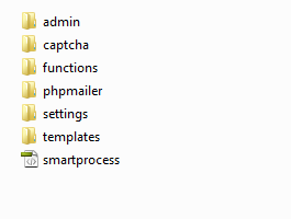
Inside the SETTINGS folder look for a file named settings.php - highlighted below
If you opened the contact form inside the sendmail-version your settings file will like like this below (using Adobe Dreamweaver as my code editor )
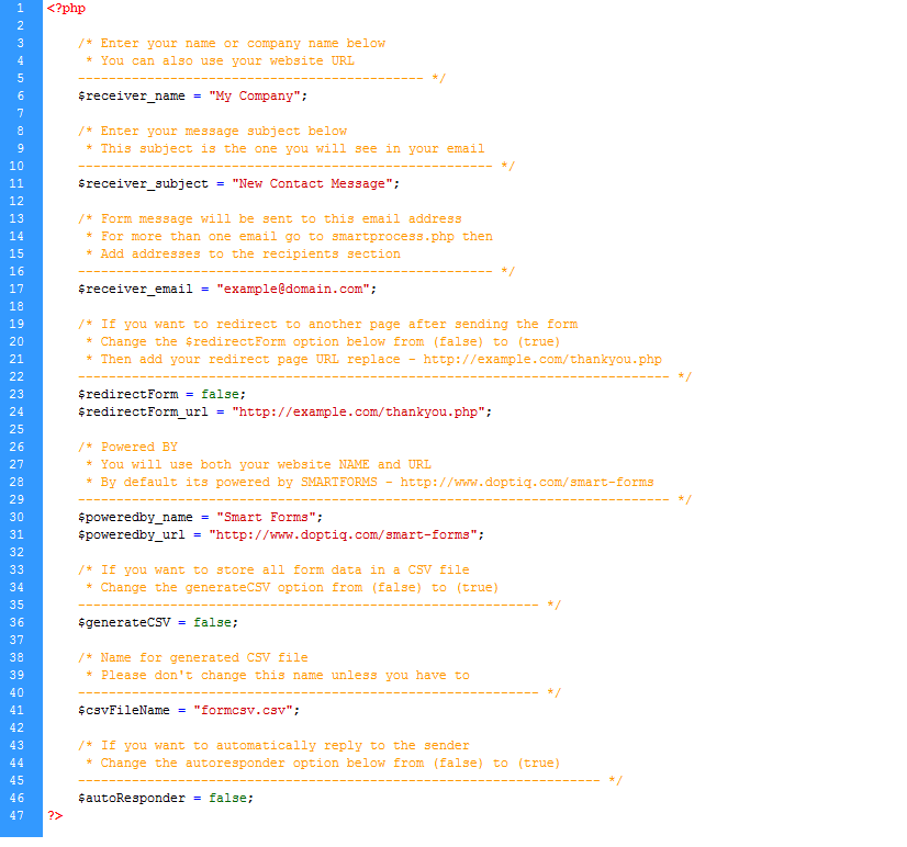
If you opened the contact form inside the smtp-version your settings file will like like this below
In short most settings you need to make are located inside the settings folder settings.php in all the form folders, and that is the only single file you need to modify and setup your recepient email addresses subjects and much more...
Overview of the settings
1 - Enter your website name or personal name or company name by - replacing the words My Company
$receiver_name = "My Company";
2 - Enter your subject - the subject basically uniquely distinguishes your message from other messages in the inbox, i mean if you open your email, all messages from your form will have this subject as the attention - for example if its a contact form your subject may something like - New Contact Message, or if its an order form something like - New Order, E.T.C
$receiver_subject = "New Contact Message";
3 - Enter your email address - this is the address where the form details will be sent - when a visitor fills the form
$receiver_email = "example@domain.com";
4 - In case you need the form details to be sent to more than one email address (other than the one you set up above), open the file smartprocess.php and look for the code below - just change the first line $recipients = false; below to true and then add the other email addresses, you can add other addresses or remove just follow the same order with a comma after a new address, replace address@example.com, with your other address, then enter the corresponding name - Recipient Name (optional)
$recipients = false;
if($recipients == true){
    $recipients = array(
				"address@example.com" => "Recipient Name",
				"address@example.com" => "Recipient Name"
    );

    foreach($recipients as $email => $name){
        $mail->AddBCC($email, $name);
    }
}
5 - If you want to redirect to another page when the form has finished sending successfully turn the option below from FALSE to TRUE - then add your Redirect URL
    $redirectForm = false;
    $redirectForm_url = "http://example.com/thankyou.php";
6 - Some people wanted to have control on the powered by message on the form templates / both message and auto responder templates please fill your details in the options below
    $poweredby_name = "Smart Forms";
    $poweredby_url = "http://www.doptiq.com/smart-forms";
7 - If you want to store the form data in a CSV file on your server turn the option below to true - the generated file will be stored inside the root of the php folder where the smartprocess.php file resides
$generateCSV = false;
8 - By default the csv file generated will have a name formcsv.csv - If you want to change that name - you will change it from there (Please note it is advisable that you leave that name as is since it is already hard coded in other CSV generating files - inside the CSV folder)
$csvFileName = "formcsv.csv";
9 - By default the auto responder message is turned off but you can atomatically send an automated thankyou message to your form sender by turning this feature below from FALSE to TRUE
$autoResponder = false;
10 - A note for those using the SMTP-version, you have additional settings to set up, if you are not sure of these ask your host to help you
- Host - Your Host SMTP servsers e.g smtp.google.com
- Username - Your Host SMTP Username
- Password - Your Host SMTP Password
- Protocol - Your Host SMTP Protocol can be ssl or tls
- Port - Your Host SMTP Port can be 25, 465, 587
// fill out your SMTP details below
$SMTP_host = 'smtp1.example.com';
$SMTP_username = 'your-smtp-username';
$SMTP_password = 'your-smtp-password';
$SMTP_protocol = 'ssl';
$SMTP_port = 465;
11 - Google reCAPTCHA SETTINGS see AJAX PHP folder - (contact-google-reCaptcha) - to setup the form with Google reCAPTCHA you will need the following
Using reCAPTCHA users can prove they are human without solving a CAPTCHA. They need just a single click to confirm they are not a robot. So, reCAPTCHA will protect your website from spam with better user experience. You can easily integrate Google reCAPTCHA in PHP script.
Get reCAPTCHA API keys from https://www.google.com/recaptcha/admin
Register your site in image below
Get your Site Key - Site key is used to display the reCAPTCHA widget in HTML
Get your Secret Key - Secret key helps authorizes communication between your site and the reCAPTCHA server
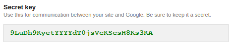
Open AJAX PHP folder find the form - contact-google-reCaptcha - open index.php look for this below
3 - Add the input HTML markup
<div id="g-recaptcha" class="g-recaptcha" data-sitekey="6LfNVScTAAAAACM_Brt8tzJBwh6A1nqCxqZLN0Px"></div>
Replace data-sitekey=" " with your key
Open php folder inside that form look for the settings folder look for this line below fill it with your secret key
$secretKey = "";
7 - Upload the files to your server, and you are done... thats it really for all forms actually, unless you want go deeper with this stuff...
Build your own forms with AJAX and PHP
1 - Setup the necessary Javascript files in your form (refer to the Javascript section)
Go to the head section of your form and include the required javascript files - like we've been doing, for most forms we need the following basic plugins below
- jQuery Library - The core library
- jQuery Form - This plugin is used for handling AJAX form submitions
- jQuery Validate - This plugin is used for form validation
- jQuery Additional Methods - This plugin is used for additional form validation methods
- smart-form - This file where i write all the form rules for validation, and ajax processing
<script type="text/javascript" src="js/jquery-1.9.1.min.js"></script>
<script type="text/javascript" src="js/jquery.form.min.js"></script>
<script type="text/javascript" src="js/jquery.validate.js"></script>
<script type="text/javascript" src="js/additional-methods.js"></script>
<script type="text/javascript" src="js/smart-form.js"></script>
2 - Setup your form markup / elements (refer to the HTML structure section)
Create a form and put all the necessary form elements eg, inputs, textareas, drop selects, radios and checkboxes, like this:-
<input type="text" name="firstname" class="gui-input" >
3 - Call the form processing PHP script
Go to your form the one yo've created - open it in a text editor - add a post method and call the processing script (smartprocess.php) like below
<form method="post" action="php/smartprocess.php" id="smart-form">
If your form includes people sending you file attachments (multipart data), don't forget the enctype, like below
<form method="post" action="php/smartprocess.php" id="smart-form" enctype="multipart/form-data">
4 - Create your clientside validation rules (refer to the javascript section)
Now open the js folder and smart-form.js create your own validation rules and messages according to your form
5 - Don't forget the name attribute
NOTE: the validation rule must correspond with the input name attribute like below name="useremail" - the rule will be useremail:required however since the input will accept only valid emails we add onother rule tp check whether its a valid email address just below useremail:required we add email:true, thats what we use to write the rule, we shall also use that name attribute to write the PHP, so that when someone fills a field, its content and values can be captured by PHP and sent to you, please refer to the Javascript section for more on validation
<input type="email" name="useremail" class="gui-input" >
Special attention on - Selects, radios, and checkboxes
For Dropdown selects, checkboxes and radios, do not forget the value=" " attribute, it is what is captured and posted in PHP, for example
In the dropdown select below the name="fruits" helps us in validation by setting a validation rule fruits:required and Posting the fruit value selected with PHP for example if the some one who filled your form selected mango fruit option - value="mango" is what will be POSTED to your email
    <div class="section colm colm6">
        <label class="field select">
            <select id="fruits" name="fruits">
                <option value="">Select </option>
                <option value="mango">Mango</option>
                <option value="pawpaw">Pawpaw</option>
                <option value="orange">Orange</option>
            </select>
            <i class="arrow"></i>
        </label>
    </div><!-- end section -->
For radios and checkboxes, the same rule applies, notice the name="media[] helps us in validation and posting the selected values in PHP, and the value="television" helps to know and capture the exact media type that was ticked / checked. The box brackets [] after the name="media" means that the checkboxes is a group with a similar name attribute media for all the checkboxes. So we can use / write an array in PHP to Capture multiple values checked by the person who fills the form
<div class="section">
    <div class="option-group field">

        <label class="option">
            <input type="checkbox" name="media[]" value="television">
            <span class="checkbox"></span> Television
        </label>

        <label class="option">
            <input type="checkbox" name="media[]" value="newspaper">
            <span class="checkbox"></span> News Papers
        </label>

    </div><!-- end .option-group section -->
</div><!-- end section -->
If you need your visitors to choose multiple options, consider using either checkboxes or the select multiple element
6 - Customize the processing script for your form
- Open any of the Ajax and PHP folders - GO to the PHP folder - copy it to the folder of your form
- Open the smart-process.php file - In this file we shall modify the contents to our own form
- Open smartmessage.php - In this file we shall modify the Email template to fit our own needs and style
We are using the contact-form folder for this explanation
Open the smart-process.php file - located inside the php folder of any of the forms - for purposes of learning we are going to use an example from the contact-form folder, its contents look like below:
<?php

	if (!isset($_SESSION)) session_start();
	if(!$_POST) exit;

	include dirname(__FILE__).'/settings/settings.php';
	include dirname(__FILE__).'/functions/emailValidation.php';


	/* Current Date Year
	------------------------------- */
	$currYear = date("Y");

/*	---------------------------------------------------------------------------
	: Register all form field variables here
	--------------------------------------------------------------------------- */
	$sendername = strip_tags(trim($_POST["sendername"]));
	$emailaddress = strip_tags(trim($_POST["emailaddress"]));
	$sendersubject = strip_tags(trim($_POST["sendersubject"]));
	$sendermessage = strip_tags(trim($_POST["sendermessage"]));
    $captcha = strip_tags(trim($_POST["captcha"]));

/*	----------------------------------------------------------------------
	: Prepare form field variables for CSV export
	----------------------------------------------------------------------- */
	if($generateCSV == true){
		$csvFile = $csvFileName;
		$csvData = array(
			"$sendername",
			"$emailaddress",
			"$sendersubject"
		);
	}

/*	-------------------------------------------------------------------------
	: Prepare serverside validation
	------------------------------------------------------------------------- */
	$errors = array();
	 //validate name
	if(isset($_POST["sendername"])){

			if (!$sendername) {
				$errors[] = "You must enter a name.";
			} elseif(strlen($sendername) < 2)  {
				$errors[] = "Name must be at least 2 characters.";
			}

	}
	//validate email address
	if(isset($_POST["emailaddress"])){
		if (!$emailaddress) {
			$errors[] = "You must enter an email.";
		} else if (!validEmail($emailaddress)) {
			$errors[] = "Your must enter a valid email.";
		}
	}

	//validate subject
	if(isset($_POST["sendersubject"])){
			if (!$sendersubject) {
				$errors[] = "You must enter a subject.";
			} elseif(strlen($sendersubject) < 4)  {
				$errors[] = "Subject must be at least 4 characters.";
			}
	}

	//validate message / comment
	if(isset($_POST["sendermessage"])){
		if (strlen($sendermessage) < 10) {
			if (!$sendermessage) {
				$errors[] = "You must enter a message.";
			} else {
				$errors[] = "Message must be at least 10 characters.";
			}
		}
	}

	// validate security captcha
	if(isset($_POST["captcha"])){
		if (!$captcha) {
			$errors[] = "You must enter the captcha code";
		} else if (($captcha) != $_SESSION['gfm_captcha']) {
			$errors[] = "Captcha code is incorrect";
		}
	}

	if ($errors) {
		//Output errors in a list
		$errortext = "";
		foreach ($errors as $error) {
			$errortext .= '<li>'. $error . "</li>";
		}

		echo '<div class="alert notification alert-error">The following errors occured:<br><ul>'. $errortext .'</ul></div>';

	} else{

		include dirname(__FILE__).'/phpmailer/PHPMailerAutoload.php';
		include dirname(__FILE__).'/templates/smartmessage.php';

		$mail = new PHPMailer();
		$mail->isSMTP();
		$mail->Host = $SMTP_host;
		$mail->SMTPAuth = true;
		$mail->Username = $SMTP_username;
		$mail->Password = $SMTP_password;
		$mail->SMTPSecure = $SMTP_protocol;
		$mail->Port = $SMTP_port;
		$mail->IsHTML(true);
		$mail->From = $emailaddress;
		$mail->CharSet = "UTF-8";
		$mail->FromName = $sendername;
		$mail->Encoding = "base64";
		$mail->Timeout = 200;
		$mail->ContentType = "text/html";
		$mail->addAddress($receiver_email, $receiver_name);
		$mail->Subject = $receiver_subject;
		$mail->Body = $message;
		$mail->AltBody = "Use an HTML compatible email client";

		// For multiple email recepients from the form
		// Simply change recepients from false to true
		// Then enter the recipients email addresses
		// echo $message;
		$recipients = false;
		if($recipients == true){
			$recipients = array(
				"address@example.com" => "Recipient Name",
				"address@example.com" => "Recipient Name"
			);

			foreach($recipients as $email => $name){
				$mail->AddBCC($email, $name);
			}
		}

		if($mail->Send()) {
			/*	-----------------------------------------------------------------
				: Generate the CSV file and post values if its true
				----------------------------------------------------------------- */
				if($generateCSV == true){
					if (file_exists($csvFile)) {
						$csvFileData = fopen($csvFile, 'a');
						fputcsv($csvFileData, $csvData );
					} else {
						$csvFileData = fopen($csvFile, 'a');
						$headerRowFields = array(
							"Guest Name",
							"Email Address",
							"Subject"
						);
						fputcsv($csvFileData,$headerRowFields);
						fputcsv($csvFileData, $csvData );
					}
					fclose($csvFileData);
				}

			/*	---------------------------------------------------------------------
				: Send the auto responder message if its true
				--------------------------------------------------------------------- */
				if($autoResponder == true){

					include dirname(__FILE__).'/templates/autoresponder.php';

					$automail = new PHPMailer();
					$automail->isSMTP();
					$automail->Host = $SMTP_host;
					$automail->SMTPAuth = true;
					$automail->Username = $SMTP_username;
					$automail->Password = $SMTP_password;
					$automail->SMTPSecure = $SMTP_protocol;
					$automail->Port = $SMTP_port;
					$automail->From = $receiver_email;
					$automail->FromName = $receiver_name;
					$automail->isHTML(true);
					$automail->CharSet = "UTF-8";
					$automail->Encoding = "base64";
					$automail->Timeout = 200;
					$automail->ContentType = "text/html";
					$automail->AddAddress($emailaddress, $sendername);
					$automail->Subject = "Thank you for contacting us";
					$automail->Body = $automessage;
					$automail->AltBody = "Use an HTML compatible email client";
					$automail->Send();
				}

				if($redirectForm == true){
					echo '<script>setTimeout(function () { window.location.replace("'.$redirectForm_url.'") }, 8000); </script>';
				}

			  	echo '<div class="alert notification alert-success">Message has been sent successfully!</div>';
				}
				else {
				  echo '<div class="alert notification alert-error">Message not sent - server error occured!</div>';
				}
	}
?>
Look closely below this line
$currYear = date("Y");
You will find our form elements captured here like this:
$sendername = strip_tags(trim($_POST["sendername"]));
$emailaddress = strip_tags(trim($_POST["emailaddress"]));
$sendersubject = strip_tags(trim($_POST["sendersubject"]));
$sendermessage = strip_tags(trim($_POST["sendermessage"]));
$captcha = strip_tags(trim($_POST["captcha"]));
Now lets open contact-form folder and open the index.php file and we look at the markup, you will notice that the first input element has a name="" attribute sendername and that is what we used to set validation and now it is what we are using to capture the data, the HTML for the first element looks like this :
<div class="section">
    <label for="sendername" class="field prepend-icon">
        <input type="text" name="sendername" id="sendername" class="gui-input" placeholder="Enter name...">
        <span class="field-icon"><i class="fa fa-user"></i></span>
    </label>
</div><!-- end section -->
so to capture the above field in PHP we used the line below :
$sendername = strip_tags(trim($_POST["sendername"]));
To set the validation rule for that field in javascript - look inside contact-form folder inside the js foldser smart-form.js, the rule looks like this :
    rules: {
        sendername: {
            required: true
        }
    }
The same logic is used for the rest of the fields actually, like sendremail etc:
Now Lets say you want to add a telephone field to that same form
You will create a field with a name attribute telephne or smething you wnat, so your input should look like this
<input type="text" name="telephone" id="telephone" class="gui-input" placeholder="Enter Telephone...">
Go to your PHP below this line
$captcha = strip_tags(trim($_POST["captcha"]));
Add your newly created field
$telephone = strip_tags(trim($_POST["telephone"]));
Next open the templates folder (its located inside PHP) smartmessage.php file and add your newly created field there also, look for this line below
<p><span style="font-weight:bold;font-size:16px">Message subject:</span> '.$sendersubject.'</p>
Add your newly created field below the above line like this:
<p><span style="font-weight:bold;font-size:16px">Telephone number:</span> '.$telephone.'</p>
To set the validation rule for that field in javascript - look inside contact folder inside the js folder smartform.js, the rule should look like this below:
The rules
    rules: {
        telephone: {
            required: true
        }
    }
The messages
    messages: {
        telephone: {
            required: 'Please fill the telephone field'
        }
    }
Some serverside validation
Lets validate the new field-
$sendername = strip_tags(trim($_POST["sendername"]));
$senderemail = strip_tags(trim($_POST["senderemail"]));
$sendersubject = strip_tags(trim($_POST["sendersubject"]));
$sendermessage = strip_tags(trim($_POST["sendermessage"]));
Handle all errors as an array
$errors = array();
Then validate the fields
	 //validate name
	if(isset($_POST["sendername"])){
        if (!$sendername) {
            $errors[] = "You must enter a name.";
        } elseif(strlen($sendername) < 2)  {
            $errors[] = "Name must be at least 2 characters.";
        }
	}
    // validate telephone field
 	if(isset($_POST["telephone"])){
		if (!$telephone) {
			$errors[] = "Please fill the telephone field";
		}
	}
Then report all errors as a list
	if ($errors) {
		$errortext = "";
		foreach ($errors as $error) {
			$errortext .= '<li>'. $error . "</li>";
		}
		echo '<div class="alert notification alert-error">The following errors occured:<br><ul>'. $errortext .'</ul></div>';
That should get you off the ground for the start - but if you find any challenges along the way, don't hesitate to contact me for help
Working with SMTP forms
For those who opt for SMTP instead of sendmail, all the forms function as the sendmail forms but the only difference is that you have to have the following details.
- Host - Your SMTP host e.g. smtp.gmail.com
- Username - Your SMTP username e.g. example@gmail.com
- Password - Your SMTP password e.g. yourgmailpassword
- Port - Your SMTP port e.g. 465
The above details are filled within the settings file settings.php in the section below
// fill out your SMTP details below
$SMTP_host = 'smtp1.example.com';
$SMTP_username = 'your-smtp-username';
$SMTP_password = 'your-smtp-password';
$SMTP_protocol = 'ssl';
$SMTP_port = 465;
CSV Export
For CSV Export to work you must enable the generateCSV option to true inside the settings.php file
If you want to store the form data in a CSV file on your server turn the option $generateCSV = false; below to true and make sure your server has the right folder permissions for writing files - the generated file will be stored inside the root of the php folder where the smartprocess.php file resides
$generateCSV = false;
Now that you have setup the forms you may need to add CSV export capabilities where by each time someone fills the form and sends it successfully the content is saved inside a CSV file like a database record, this is how you should go about it. Please note that this may require your server permissions
The files located inside the ADMIN folder - you will find dataprocess.php and index.php These files are for purposes of displaying your form data as a table of data fully sortable and searchable like the way you work with database data
VERSION 3 USERS NOTICE: To add password protection to the CSV file viewer the folder CSV was changed to ADMIN so please replece the CSV folder with the new ADMIN folder just copy it from any of the AJAX PHP forms - the rest will work automatically you dont have to make any changes to your form scripts. Its just a simple copy and replace / paste
After capturing your form fields such as below and posting values below
	$sendername = strip_tags(trim($_POST["sendername"]));
	$emailaddress = strip_tags(trim($_POST["emailaddress"]));
	$sendersubject = strip_tags(trim($_POST["sendersubject"]));
	$sendermessage = strip_tags(trim($_POST["sendermessage"]));
We create a CSV file named formcsv.csv and also post the above values to the CSV file like below, please note that the values in the CSVData array match the ones above. Here are the CSV posted values. This should work even for your already existing forms
if($generateCSV == true){
    $csvFile = $csvFileName;
    $csvData = array(
        "$sendername",
        "$emailaddress",
        "$sendersubject"
    );
}
Next generate the CSV file only when the form has been sent successfully inside smartprocess.php, so go to the function that confirms successful sending of the message, the code looks like below - ihave also added ;
/*	-----------------------------------------------------------------
: Generate the CSV file and post values if its true
----------------------------------------------------------------- */
if($generateCSV == true){
    if (file_exists($csvFile)) {
        $csvFileData = fopen($csvFile, 'a');
        fputcsv($csvFileData, $csvData );
    } else {
        $csvFileData = fopen($csvFile, 'a');
        $headerRowFields = array(
            "Sender Name",
            "Email Address",
            "Subject"
        );
        fputcsv($csvFileData,$headerRowFields);
        fputcsv($csvFileData, $csvData );
    }
    fclose($csvFileData);
}
Please note the $headerRowFields = array the names there will be the CSV top row header names. These are only written once. When you post values you should see a CSV file created inside the php folder
For easy data management i added a simple php script to generate a table of all your form data so that you can easily search through the records. You can access it by typing your-form-url/php/admin there you can also download the CSV file directly.
The page will prompt you / redirect you to a login page - just provide username and password
Setting up your own usernames and passwords
Open the ADMIN folder and find the file named users.php and locate these lines below
    "elflaire" => "04fdf4f93e6b60fc7acd94f47028ce7f",
    "Envato" => "4a3f8e0dc6f175f2ff0e069904012453"
The first lines elflaire and Envato represent the usernames while corresponding the long strings of characters 04fdf4f93e6b60fc7acd94f47028ce7f and 4a3f8e0dc6f175f2ff0e069904012453 represent HASHED PASSWORDS
In reality without the HASHING the usernames and passwords are like this below
    "elflaire" => "smart-forms",
    "Envato" => "codecanyon.net"
So that is what you entetr in the login form to access your dashboard for form data posted
HASHING YOUR PASSWORDS
You can enter your username in any characters ranging between (A-Z + 0-9), however on the password end you need an MD5 Hashing tool to achieve this you can use http://www.md5.cz
Create the password you want - make sure its a strong pasword you can use strong password generators to generate one and save it because you are going to use it while signing into your account - then put those characters into the Hashing tool like http://www.md5.cz then put that string against the corresponding username in our users.php
Autoresponder emails
When a person fills a form you can automaticalley send them a response to their email addresses. To do so you need to do the following
Inside each form smartprocess.phpyou will find an auto-responder section that looks like this below
include dirname(__FILE__).'/templates/autoresponder.php';

$automail = new PHPMailer();
$automail->isSendmail();
$automail->From = $receiver_email;
$automail->FromName = $receiver_name;
$automail->isHTML(true);
$automail->CharSet = "UTF-8";
$automail->Encoding = "base64";
$automail->Timeout = 200;
$automail->ContentType = "text/html";
$automail->AddAddress($emailaddress, $firstname);
$automail->Subject = "Thank you for contacting us";
$automail->Body = $automessage;
$automail->AltBody = "Use an HTML compatible email client";
$automail->Send();
Make sure that this line $automail->AddAddress($emailaddress, $firstname); especially the $emailaddress line represents the email address fileld you used on the form.
The auto responder message template - autoresponder.php is located inside the templates folder There you can type the message you want to automatically be sent to the form sender inside autoresponder.php
Processing different form elements with PHP
These can be handled easily with PHP action POST - using the name attribute like this below
Inputs - all form input elements can be hanlded using the name="myinput" attribute with php like this below
<input type="text" name="myinput" id="myinput" class="gui-input">
$myinput = strip_tags(trim($_POST["myinput"]));
Textareas - all form textarea elements can be hanlded using the name="mytextarea" attribute with php like this below
<textarea class="gui-textarea" name="mytextarea"></textarea>
$mytextarea = strip_tags(trim($_POST["mytextarea"]));
Form selects - all form select elements can be hanlded using the name="myselect" attribute with php like this below
<select name="myselect">
    <option value="">Select </option>
    <option value="mango">Mango</option>
    <option value="pawpaw">Pawpaw</option>
    <option value="orange">Orange</option>
</select>
$myselect = strip_tags(trim($_POST["myselect"]));
Form Radios - all form radio button elements can be hanlded using the name="myradio" attribute with php like this below
<input type="radio" name="myradio" value="Female">
<input type="radio" name="myradio" value="Male">
$myradio = strip_tags(trim($_POST["myradio"]));
Checkboxes - checkbox elements can be hanlded using the name="mycheckbox[]" attribute with php like this below
<input type="checkbox" name="mycheckbox[]" value="television">
<input type="checkbox" name="mycheckbox[]" value="newspaper">
	$mycheckbox = $_POST["mycheckbox"];

	if ($mycheckbox[0]!=""){
		$mycheckbox_list = implode( '<br/>', $mycheckbox);
	}
Multiple select - multiple select elements can be hanlded using the name="mymultiselect[]" attribute with php like this below
    <select name="mymultiselect[]" multiple="multiple">
        <option value="mango">Mango</option>
        <option value="pawpaw">Pawpaw</option>
        <option value="orange">Orange</option>
    </select>
	$mymultiselect = $_POST["mymultiselect"];
	if ($mymultiselect[0]!=""){
		$mymultiselect_list = implode( '<br/>', $mymultiselect);
	}
The AJAX Trick
Well up to this point i would like to thank you for your patience, it takes lots of patient to move through folders codes files...
Most times when you push the send button the form is sent and the page is reloaded to a new page by default which is the processing script, howvever AJAX helps us to post the form without the page reloading
Now we go back to our JavaScript file where we set our validation - look inside contact folder (or other form folders) inside the js folder smart-form.js, then add the submit handler which should look like this below:
submitHandler:function(form) {
    $(form).ajaxSubmit({
            target:'.result',
            beforeSubmit:function(){
            },
            error:function(){
            },
             success:function(){
                $('.alert-success').show().delay(10000).fadeOut();
                $('.field').removeClass("state-error, state-success");
                if( $('.alert-error').length == 0){
                    $('#smart-form').resetForm();
                    reloadCaptcha();
                }
             }
      });
}
The sending button - changing text when sending is in progress
When you hit the submit button on the working forms you will notice that the text changes to Sending... that is a simple function i added the sending text can be changed to any text of your choice by using this data attribute data-btntext-sending="Sending..."
<button data-btntext-sending="Sending..." type="submit" class="uit-button btn-blue"> Submit Form </button>
Adding captcha to your Forms
CAPTCHAs help us to reduce the amount of SPAM emails from AUTOMATED BOTS-
Why 2+3 may not be enough
Sometimes we can set a simple math question and it will do the job but sadly AUTOMATED BOTS - are now intelligent enough to do the math for you so they can easily out smart most simple math captchas.
A simple PHP session CAPTCHA
I have included a simple PHP session captcha which you can use on your forms to reduce Spamming activity on your forms it is located inside the PHP folder - captcha folder
Some good CAPTCHA practices
- Fonts Matter - Well i have included two great fonts from ZXX Captcha Specimen Fonts these demonstrate how a good captcha font should be - can easily be identified by a human but not Optical Character Recognition (OCR) software. Why? Because smart AUTOMATED BOTS use OCR tools to solve and break captchas! If you use simple fonts like ARIAL - Well you may run into trouble where by every simple OCR tool can break your CAPTCHA. I have tested all my captcha fonts with this simple Online OCR Tool to see the validity of this matter and my tests show that fonts such as the ones included or OLD TYPEWRITTER fonts can confuse most OCR tools while the likes of ARIAL are a piece of cake.
- For those in search of a bullet proof solution - You can give these two a try Google's RECAPTCHA or SECURIMAGE read their documentation on how you can integrate them in your forms
- And all the others - The above two should make a great starting point!
1 - Changing captcha text color
Open captcha.php and look for the lines below (rgba values only supported) - you can use a color picking tool to help you pick any colors with rgba values my favourite is Colorpix from color schemer + it's FREE of charge
$color = imagecolorallocate($image, 136, 136, 136);
2 - Changing captcha font
Open captcha.php and look for the lines below (only Open Type Fonts (otf) OR True Type Fonts (ttf) are supported) replace with your font in the fonts folder located inside captcha
$font = 'fonts/zxxnoise.otf';
4 - We're Done!
A simple note on security
I am no security expert, but when you are building a form, there are some things on security you should know or consider!
1 - Forms with file attachments
If you have a form and you want to receive a ttachments from your form visitors, please put in mind the following things:-
Do server side validation
If you've been around the web for so long you will understand that clientside validation (with javascript) usually has some severe limitations, one of them being that it can easily be by passed or turned off from the browser by disabling javascript. So all the forms inside the folder serverside validation + captcha aim at giving an alternative layer of validation and some level of security in case some one deliberately turns off Javascript from their browser . Your validation for forms with file attachments should aim at achieving some of the following:-
- Limit the size of uploads to be sent to you to something like 2MB or your liking - This is used on all forms i have included that include attachments
- Limit the file types to be sent to you eg JPG, PNG, PDF etc - This is used on all forms i have included that include attachments
- Check file info - The second rule above can easily be by-passed by renaming a PHP file with a say a PDF extension so file info is more reliable, however it is only supported on servers running PHP version 5.3 +, so you much check your server for the PHP version else it may bring errors in your forms - This is used but i commented it out you will have to uncomment it if you are running PHP 5.3+ on your servers
- Scan your files for malware, trojans and malicious threats with Clamav - Well for this one i haven't tried it out but you can do a quick google search or find out more HERE
- Rename all files on upload - When the person uploads a file immediately rename it with a random name so that they cant access it. This is used on all forms i have included that include attachments
- Delete all files from the server immediately they are attached to the email - This is used on all forms i have included that include attachments, you can remove it from the forms if you want to leave attachments on your server
- Do not host your forms uploads folder in the server root - if your domain is like
www.doptiq.comavoid putting your form uploads folder in the root where someone can access it by just typingwww.doptiq.com/uploads/you can move your uploads folder one level above to something likewww.doptiq.com/contact/uploads/this way scripts wont be executed on your server - You can also use .HTACCESS (apache serever users only) to block execution of certain scripts inside your uploads folder - You will also do a google search on this one... or try answers like this one on stackoverflow
2 - Battling with SPAM
- Use CAPTCHA - Yes i have already mentioned it above, but in retrospect - I have included a simple CAPTCHA for this purpose
- Do serverside validation too - Yes of course when someone turns of JS they can, do whatever they want with your form if it has no validation on the server side...
Trouble Shooting
Form shows an error message on submitting
When the form shows an error without specifying which error it is for exampe Message not sent - server error occured! please do look into the following
1 - Look inside the php folder and see if theres and error log
2 - Try Removing these lines inside smartprocess.php. Look for
If you are using SENDMAIL VERSION
	$mail->isSendmail();
	$automail->isSendmail();
If you are using SMTP VERSION
	$mail->isSMTP();
	$automail->isSMTP();
Form shows a message that it is successfully sent on submitting but no email comes through
When the form shows a success message without sending the email message to the receiver email, please do the following
Cross check your email address included in the receiver email $receiver_email = "example@domain.com";
Switch to SMTP instead of Sendmail, you can ask your host for your SMTP details or if they support SMTP, if not switch to a free SMTP service such as google smtp service if you have an account with google.
Please check whether your host blocks external scripting, i have noticed this is a major issue with some clients on shared hosting especially on these two hosts GODADDY and BLUEHOST, this has been resolved when you talk to your host. So talk to your host when this happens, or persists, they will be of great help.
Masking issues on Android
Masking on Android devices may at appear problematic while using certain input types. If you are using tel and number input typles please change them to text, that will fix some common masking issues!
While applying masking avoid using these input types below
<input type="tel" class="gui-input" >
<input type="number" class="gui-input" >
Instead use...
<input type="text" class="gui-input" >
Slow response for chexboxes, radios, toggles and ratings on old Android and IOS devices
Checkboxes, radios, toggles, captcha refresh and ratings may appear unresponsive when tapped on older versions of both Android and IOS especially versions 2.3 or less and IOS 6 and less respectively! This is caused by a bug on both of these OS which makes treats / renders labels unclickable. To solve this, add an empty onclick="" attribute to the parent labels enclosing the above mentioned elements.
Add an empty onclick on parent labels to fix IOS, like this (using checkboxes as our example below):-
<div class="section">
    <div class="option-group field">

        <label class="option" onclick="">
            <input type="checkbox">
            <span class="checkbox"></span> Checkbox 1
        </label>

        <label class="option" onclick="">
            <input type="checkbox">
            <span class="checkbox"></span> Checkbox 2
        </label>

    </div><!-- end .option-group section -->
</div><!-- end section -->
CAPTCHA Image / text not showing
Captcha images require a server with a GD Library Installed to generate the images, so please confirm whether your hosting server has this feature. Alternatively some anti-virus software and ad-block plugins may prevent your captcha image from showing!
Clientside Validation and Ajax not working well in IE9 and less on forms with file uploads
On some forms i added a custom validation method for checking file size. This feature is only supported in modern browsers that support the new HTML5 file API. In case this causes your validation to fail in older browsers remove these codes below
Open smart-form.js and remove the following lines
    /* @custom validator method | check filesize | modern browsers only
    --------------------------------------------------------------------- */
    $.validator.addMethod('filesize', function(value, element, param) {
        return this.optional(element) || (element.files[0].size <= param)
    });
Modify the file validation rules and messages also like this
From this rule:-
    orderfiles:{
        required:true,
        extension:"jpg|png|pdf",
        filesize: 1048576
    }
To this rule:-
    orderfiles:{
        required:true,
        extension:"jpg|png|pdf"
    }
From this message:-
    orderfiles:{
        required:'Browse to add some order files',
        extension:'Sorry, file format not supported',
        filesize: 'File size exceeded, upload 1MB or less'
    }
To this message:-
    orderfiles:{
        required:'Browse to add some order files',
        extension:'Sorry, file format not supported'
    }
Sources and Credits
- jQuery Form - Ajax Form Processing
- jQuery Validation Plugins (validation + additional methods)
- jQuery UI Custom Build - (Datepicker + UI Slider)
- jQuery UI Month Picker Addon (Maintained Repo)
- jQuery UI Time Picker Addon
- jQuery Masked Input - Form masking
- PHPMailer - Form Processing Library
- Spectrum Color Picker - Color Picker
- Numeric Stepper - Number stepper
- Touch Punch - Touch events support for the jQuery UI user interface library.
- FontAwesome Vector Icons
- Roboto Google Font - The Official Android Mobile OS Font
- ZXX Captcha Specimen Fonts
- jQuery knob widget - Converts a form input into a touch knob dial
- jQuery autotab widget - Automatic input tabbing
- jQuery select 2 widget - A rich select element with search sort filter capability
- jQuery geocomplete widget - Select and search locations using google maps API
- Dropzone js - Drag and drop file widget
- International telephone input - Filter and validate international telephone numbers
- Show and hide passwords - Toggle show hide passwords on fields
Well it has been a long journey, thank you for sticking by, and most importantly making the decision to buy this product - hopefully you found it worth while - please don't forget to throw in a word or suggestion about how we can improve this product together, i welcome constructive criticism and so i will be honored by your feedback - And hey if you feel like it, why not rate it 5 stars over the moon!
Once again, I'll be honored to extend a helping hand i case you meet any challenges along the way, don't hesitate to ask however small or trivial an issue may seem, and if you have any questions or suggestions regarding this item, please feel free to email me via my Codecanyon public profile page contact form HERE - ELFLAIRE . All the best wishes... while creating the SMARTEST FORM.
Regards - IGGA ELIA - a.k.a - elflaire